
In the series: Signal Processing Series
Introduction
As stated in Part One, signal processing forms the foundation of the current multimedia revolution. Part Two is intended to demonstrate basic, but important, audio and image editing applications, that we otherwise take for granted in our daily interactions with media. In particular, three applications are demonstrated: Audacity, Sonic Visualiser, and Gimp.
Audacity explores how to read a basic spectrum plot, which in technical terms is a signal in the frequency or spectral domain. Sonic Visualiser explores spectrograms and the idea of data visualisation. Finally, Gimp explores spatial frequency and edge detection, resulting in various filters users can see and apply first hand.
The main objective of this module is to introduce the core toolset of digital signal processing: Fourier Transforms and Filter Theory. The narrative focus explores the major relationships and applications of these tools, alluding to but otherwise buffering the underlying math.
A overarching theme is the idea that these are tools, and like any tool there is a period of learning and adjustment which can be initially intimidating, but these tools are still accessible. Furthermore, this notion teaches students to think critically about the tools, and that each has its own strengths and weaknesses based on the context of application.
This module connects to elements of Math, Physics and Computer Studies.
Some Questions to Ask Yourself
- How do you read the frequencies that make up a signal?
- How are artificial voices (such as Apple’s Siri or Amazon’s Alexa) synthesized?
- How does the blur or sharpen features work in Photoshop or Gimp?
As mentioned in the introduction, there are three major concepts demonstrated by Audacity, Sonic Visualiser, and Gimp. Of these three, the concept most difficult to grasp is edge detection, which interprets edges as high spatial frequencies within an image. A non-computer activity to assist in explaining this relationship could be a physical demonstration followed by a discussion.
For example, one could place a tennis ball on top of a basketball, let them drop, and discuss the combined bounce. The basketball, having a lower bounce represents low frequencies, while the tennis ball with its higher bounce represents high frequencies. Their combined bounce represents a rapid change from low to high (spatial) frequencies indicating an edge, as in rapidly going from dark to light or vice versa (rapid tonal contrast as edge). One can then communicate the idea of filtering low or high frequencies by separating and dropping only the basketball or tennis ball respectively.
What is Signal Processing?
This question was explored in Part One, but as this module goes deeper into the subject, it might be time to ask this question again.
In the business of technology, the term “killer app”, refers to a computer application that everyone needs, wants, or can’t live without. In a similar sense, signal processing is like a killer app: all the music, movies, and videos on your phones and other devices are made possible from signal processing theory. Without it, we wouldn’t have any of that: No cat videos. No Yanny vs Laurel. Nothing! And that would be sad.
Signal processing is a core toolset used to record, save, edit, and play the media all around us.
Learning Style
How do you learn? I will explain my way:
Always offer dignity to your spirit helpers.
In days past, Inuit Angakkuit had tuurngait (spirit helpers) to assist them. These spirits gave great power to those who wielded them, but they also had to be respected as they were still spirits.
Maybe we are not the angakkuit of old, but we are clever people, and we have modern tools and theories that give great power to those of us who wield them. We should offer dignity to our tools the way angakkuit offered dignity to their tuurngait. We can honour our tools by learning how they work. In this way we can understand how to take better care of them, so they can serve us in a good way when needed.
I try not to use a tool if I do not understand how it works, or if I could not build it myself when needed. Of course, in this modern world with complex modern tools this is not always possible, but I still try. This is my way of learning.
Relationships
Signal processing is a big subject. It is not possible to learn about all aspects of it in a single module like this. My intention is to show you the major relationships that exist, what to expect, and where to look if you want to learn more on your own.
As for the relationships, there are many signal processing tools already available in programs like Audacity or programming languages like Python, so knowing even these basic relationships and their terminology helps to navigate and understand these technologies as well as many others you will come across in your careers.
In any case, the first and simplest relationship in signal processing is when you record a signal and process it:
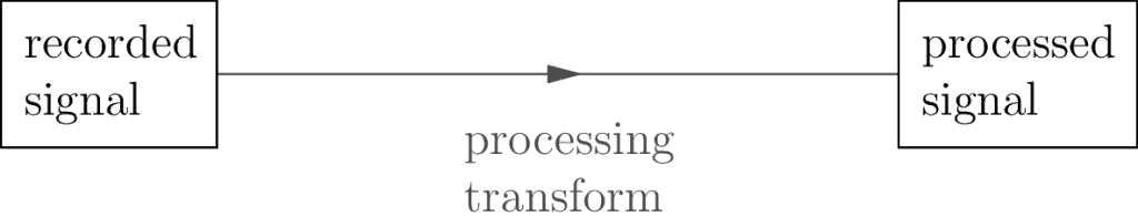
This is so simple. It’s too simple. So much so we have to ask: What does this even mean?
The first part of this relationship is being able to record signals. In Part One we recorded an audio signal in the Audacity example. Every type of signal such as audio, image, or video has its own hardware technology to make recordings. Audio has microphones, photos have cameras, and videos have both. Many other signals such as multispectral images use sensors, and if you look at signal processing applied to medical technologies or environmental technologies there are many other types of sensors used to read and record, but these topics won’t be covered here.
Though the hardware technology may be different in each case, what’s similar for each of these recorded signals is that the recordings are made by taking small samples which measure time or space and storing this data in some sort of memory file. The samples that make up the recordings are then modified, changed, or transformed to create the processed signal—the resulting signal is therefor made up of processed samples. At one point In the Audacity example in the previous module we took the original audio recording and amplified it. There we were already doing signal processing!
Here’s the truth about signal processing: Any transformation of one signal into another is signal processing, and really there is no absolute best way to process a given signal. For example, you could take an image and change the color one pixel (sample) at a time, in any way you want, and that’s signal processing. If that’s the case, why bother learning the theory offered here?
What are the other relationships? Let’s continue.
Tools
There are two powerful tools I’d like to share in this module: Fourier Transform as well as Filter Theory. Fourier Transform allows us to look at our signal in terms of its oscillation frequencies. Filter Theory gives us a standard way to create, analyze, and categorize (signal) transformations.
The Fourier Tranform
Have you ever heard of Taqriaqsuit? They are the shadow people. Some say that if you see them, they disappear into the ground. Others say they can turn 90 degrees sideways, and when they do they get thinner and thinner until they vanish! It is said they live in a world like ours, and when they disappear it is because they return to their domain.
This idea of a parallel domain, of being able to crossover and return, is very similar to the behaviour of signals and the Fourier Transform. Signals are like the Taqriaqsuit, and the Fourier Transform is the secret to how these signals vanish and crossover to their domain. This is interesting to us because when they return to their domain they show themselves in a different way, and we can learn more about them. I wonder if it’s the same for the Taqriaqsuit?
Inuit stories aside, what does this mean for us? The Fourier Transform lets us decompose a signal back into the frequencies used to build it up in the first place. When we break it down this way, we say it has crossed over into the spectral domain. When our signal is in this domain, we call it the spectral signal to make it clear and remind ourselves which version of the signal we are looking at.
How does this work? I won’t go into the math here, but I will offer a modern analogy: let’s say you open up a music player, and the songs are listed by song title, but you want to find an artist instead, so you reorder the list by artist. It’s the same information in the list, but you now have a different way of navigating it. That’s the general idea.
The fancy term for this reordering of info is called a change of basis, which is part of a branch of math called Linear Algebra. The Fourier Transform then, lets us take a signal and reorder its internal data so that it’s easier to see the frequencies that make it up. It’s the same information in the signal otherwise, just a different perspective.
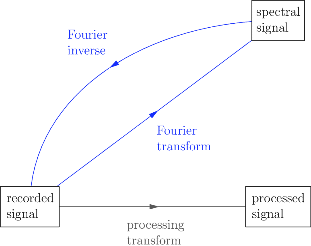
The word spectral more or less means frequency, by the way. You could also call it the frequency domain. Though this is technical jargon, as mentioned above, it helps remind us of where we are which can be useful when we’re working with a lot of details (which is often the case).
The above diagram also mentions the Fourier Inverse, which is more formally known as the Inverse Fourier Transform. In this module I call it the Fourier Inverse to keep things simple. The Fourier Inverse lets us continue with the spectral signal and transform it back into the original domain. The idea is if you can decompose a signal into the frequencies that make it up, you should be able to recombine those frequencies to get back the original. The math that makes this happen is slightly more complicated than that, but otherwise the idea holds true.
Now, on its own the Fourier transform sounds simple enough, but it’s also the starting place for more general and more powerful techniques that allow us to understand hidden details of a signal. To explore this further, I offer a new Audacity example, and if you find you want to take things even further I present a more advanced Sonic Visualiser example as well.
Audacity Example
Start by making a simple voice recording. As we’ve already done a recording in Part One, I’ll skip the how to step and leave it for review here. We can assume we know these details and that we’ve made such a recording already.
Let’s Fourier!
So here’s our recording:
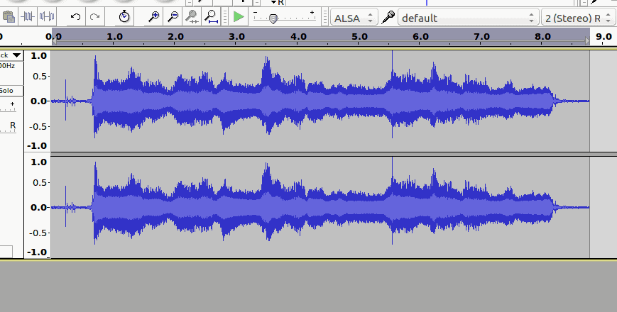
This example uses the recording from the previous module, feel free to make a new recording for yourself if you prefer, but if you plan on exploring the Sonic Visualiser example that follows, it may be easier to save the recording you use here until then.
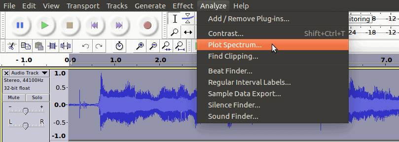
Audacity doesn’t use the phrase Fourier Transform, it uses another name. In order to convert our signal to the spectral domain—to see its frequencies more clearly—we go to the Analyze menu, and click Plot Spectrum….
Here it is!
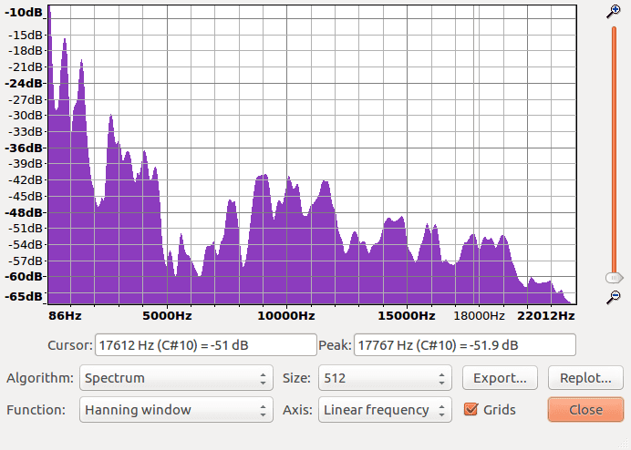
So how do we read this?
That’s the tricky part. The thing to know before we delve into this is that the underlying math that makes all of this work ends up creating several trade-offs. We don’t need to know the math, but we need to know the trade-offs, and that’s the source of the complications we’re about to see. Don’t worry, it’s not as bad as you think, we just need a good story to start us out and to keep things focused.
Fourier Transforms
When you get deeper into signal processing you’ll find a lot of it is about trade-offs, actually. The first and most important one comes from the fact that there is more than one version of the Fourier Transform.
Why? The first version of the Fourier Transform is called the Continuous Fourier Transform (CFT). This version is best when our recording is an analog (continuous) input signal. It’s not very practical for us, because the recorded signals we will be interacting with are digital (discrete). The second version of the Fourier Transform is called the Discrete Fourier Transform (DFT), and will work best for our purposes.
Wait, there’s more. The third version worth mentioning is called the Fast Fourier Transform (FFT). In reality it’s actually just the Discrete Fourier Transform, but the software algorithm used to calculate it is optimized to be extremely efficient, and so it has its own name. Don’t worry, you won’t need to know the detailed differences between these versions, but they’re worth mentioning because you’ll often see their names used in the literature, so it helps to know what you’re dealing with.
Finally, there’s what’s called the Short Time Fourier Transform (STFT). Notice in the above spectrum plot we applied the Fourier Transform to the whole recording and returned a spectral signal? We haven’t yet learned how to read its frequencies, but that doesn’t stop us from realizing there’s a limitation to this approach: let’s say we could read the frequency information, and we discover there’s a frequency of 440 Hz. We still have no idea where in the recording this frequency actually occurs. Is it 5 seconds in? Right at the beginning? When? This is what the Short Time Fourier Transform is meant to solve.
Trade-offs
The second major trade-off comes from the Short Time Fourier Transform. The idea behind the transform itself is to take a recorded signal and split it up into many smaller sub-signals. That way for any given time in the recording, you can see what frequencies it’s made of. The trade-off then is between time vs frequency.
Why? Again, it has to do with the underlying math. Without going into detail, what it means for us is if you want to use smaller intervals of time, you have to accept that the frequencies recovered from the Fourier Transform will be a little less accurate. On the flip side, if you want more accurate frequency information returned, you have to accept wider (or less accurate) time precision.
Let’s again pretend we found a frequency of 440 Hz in our spectral signal. The time vs frequency trade-off says if we took really narrow time intervals, then perhaps the frequency that actually occurs is 442 Hz, but because of the trade-off the best measurement we obtained was 440 Hz. Or it’s possible there were two frequencies of 438 Hz and 442 Hz but we couldn’t distinguish them because we made this trade-off.
Before moving on I should mention that in the case of image signals we instead frame this trade-off as: space vs frequency, but I’ll continue focusing on the time domain to keep things simple.
In any case, when you’re a signal processor, these are the sorts of trade-offs you learn to work with. It takes a bit of practice, but like with everything else, you get use to it.
Reading Spectral Signals
The Short Time Fourier Transform automatically divides a signal into sub-signals and computes their corresponding spectral sub-signals, but for our sake—for the sake of learning—let’s just take a single sub-signal from our recording and manually plot its spectrum ourselves:
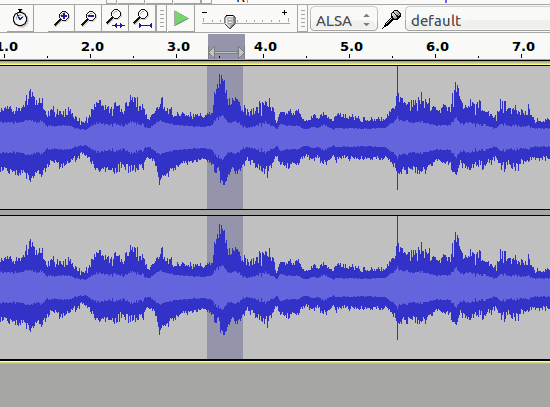
When we plot the spectrum (similar to the first time), we get:
Now we’re nearly ready to learn how to read frequencies! We have just one more quick detour.
Basic Reading
We start with the horizontal axis, which plots frequency. Reading from left to right, the units start at lower frequencies around 20 Hz, which have low pitch sounds. Our axis then ends around 20,000 Hz with high pitch ones. Frequencies can go both lower and higher than this range but, as it turns out, humans on average can’t hear lower than 20 Hz nor do we hear higher than 20,000 Hz, so most of our recordings don’t bother keeping track of that information.
Are there any animals that can hear higher than 20,000 Hz? Dogs certainly can! Our digital music must sound funny to them. If we were them and we heard human music, it would be like hearing a song but we could only hear the low notes. I wonder what range polar bears can hear? The fact that we only save sounds in human hearing range might be a bit human centric, but keep in mind our audio and video recordings take up memory resources as well. If we don’t have any specific reason to keep track of this level of information, it’s probably not disrespectful to our animal friends.
The vertical axis measures amplitude in decibels (dB). Since I have not previously discussed these units, I will talk about them here. Decibels are a way to measure loudness. The spectrum in our plot ranges from -64 dB to -9 dB, which may seem confusing if this is your first time encountering them. Just know that -9 dB is louder than -64 dB. The negative numbers come from using what’s called the logarithmic scale, but we won’t go into that here.
Decibels aren’t the only way to measure loudness, but they’re standard and well known. If you spend more time in sound related fields, you’ll likely encounter decibels. They’re worth knowing if you want to spend more time involved in multimedia projects, to say the least.
Frequency Reading
Finally!
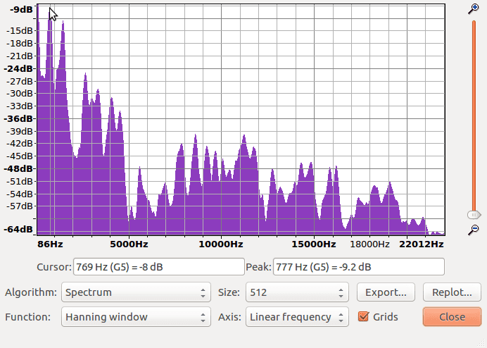
Reading frequencies is as simple as reading the peaks:
See the cursor in the above plot hovering around the second leftmost peak? The text below the graph it says the cursor is at 769 Hz with a loudness amplitude of -8 dB. Following that, Audacity actually figures out what peak we’re trying to examine and tells us precisely that it’s 777 Hz at -9.2 dB. This means that our sub-signal is composed of several frequencies, one of which we now know to be 777 Hz. The remaining frequencies can be read in a similar way.
The other thing worth mentioning is that the plot itself can be misleading because it suggests relationships between Hz and dB along all the non-peak coordinates. A good way to think of this is that the signal itself contains a lot of information, but the tool we use here only reveals certains types and certain amounts. The tool creates some inaccurate information as a byproduct. For this plot spectrum tool it’s best just to focus on the peaks.
Advanced Reading
What you’ve learned so far is enough for a basic understanding, but for the curious and motivated I offer one more trade-off: windowing.
Windowing comes about when we convert from the Continuous Fourier Transform to the Discrete Fourier Transform. When you apply the Short Time Fourier Transform (and thus the DFT) to a recorded signal, you end up with what’s called spectral leakage. Without going into the details, what basically happens is the trade-offs created from the math end up leaking frequency information which makes the returned spectral signal kind of messy. Windowing is the solution engineers came up with to smoothen this messiness.
My description here isn’t completely accurate. Think of it more like a translation into English of what’s happening with the math. In order to keep things simple and intuitive, some accuracy will get lost in translation, but overall I’d say that’s the general meaning behind it.
In any case, what this means for us is that there are two specific trade-offs to look at, window type and window size.
Let’s start with window type: Just as the Fourier Transforms are tools that we apply to signals, we can think of windows as tools we apply to Fourier Transforms. This isn’t as odd as it sounds: A hair clipper is a tool, and a brush is another tool we use to clean the hair clipper. That being said, as with many other tools there’s no best type of window, so engineers have come up with a few different ones. Some work better in certain conditions, others work better in others.
In our above example, the drop down menu for window types is the Function menu, which is set to the Hanning window. Don’t worry, these details might seem intense but Audacity makes good choices here for these basic things. In anycase, it’s good to have an idea of what this option means, even if you don’t use it all the time.
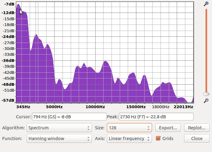
As for window size: it might seem strange, but think of a window as a signal. As with other signals, we take a recording of it. In this sense, window size is similar to the sample size of a recording. In the above example, if you look at the Size drop-down menu, it’s set to 512. This is like saying we’ve sampled the Hanning window 512 times to making our recording of it. When choosing the window size, we’re looking for a happy middle. If the window size is too small, the resolution of the spectrum plot will be less accurate (too smooth). If the window size is too large, it might give the appearance of being accurate but is otherwise misleading (too jagged). To know exactly how to figure this out, there’s a math formula you use to make these calculations, but until you know this level of detail it’s probably best to go with the default that Audacity gives you.
To demonstrate, let’s change the Size drop down menu (set to 512 in the above) to 128 and see what happens:
Notice how the overall shape is the same, but the peak information seems far less accurate. Many peaks have been blurred and combined into one. There’s no harm in playing around with these settings and getting a feel for how things change. Try it out yourself!
Conclusion
That’s about it for this Audacity example. The main takeaway I would say is that Fourier Transforms are powerful tools, but they’re not perfect either. If you play with the various settings, you’ll find both the amplitude and the frequency information varies as your settings change, but comparing the two, the frequency information actually varies less. To put this another way, the trade-offs used to create Fourier Transforms reduce perfect accuracy, but otherwise are fairly reliable in helping us to determine the frequency information of a signal.
To become proficient at this kind of analysis, the skill to develop is in finding a balance in terms of the trade-offs. To be a professional analyst you need to be able to justify why you’ve chosen your particular version of each trade-off as opposed to other possibilities.
If that’s not your goal, it’s still useful for hobbyists to be able to read this kind of information. Try it out with the recording you made. Split it up into intervals, then listen and see if you think you’ll find high or low frequencies when you plot the frequency spectrum of each. You know enough now to test it out!
Another takeaway is how we think about tools in general: for example, compare needle-nose pliers to slip joint pliers—both are very similar, and they can be interchanged for many purposes, but the reason they exist separately from each other is that they are specialized. One works better in some situations, while the other works better in other situations. Fourier Transforms, as well as the trade-off settings used when applying them are similar in this way. They may seem intimidating at first, but they just take some getting use to.
I will end this section off with a provocation: learning how to balance trade-offs applies to many parts of life in general.
Maybe pliers aren’t your thing. As an alternative example, consider leadership skills and relationship skills. If you’re a leader you may need to coordinate people, and sometimes you need to critically observe how you interact with people, as this affects your ability to lead. Alternatively, let’s say you have a relationship in your life that you value, therefore you want to take care of your shared feelings. Either way, you have to think about how you interact with people and what kinds of trade-offs exist. Though it may sound cold-hearted, this is often what leadership and relationship skills involve, so be sure to have fun and take care of each other along the way.
My point is, in many places and situations there are different skills and trade-offs to be aware of. Learning to think critically about them can go a long way.
Sonic Visualiser Example
In this software demonstration we’re going to build on top of the previous Audacity example by learning how to plot and read the Short Time Fourier Transform of a signal, also known as a spectrogram.
Continue using the audio recording from the Audacity example, or another audio recording you have. Whichever recording you use, ensure it is an .mp3 format, so that it works smoothly for this example. Exporting a recording as an .mp3 can be done in Audacity.
Requirements
Now we’re going to work with an open source software program called Sonic Visualiser. Download the free software here, following the instructions for your operating system.
Let’s Spectrogram!
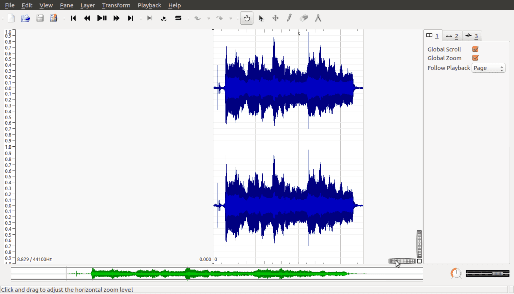
Launch Sonic Visualizer and open the saved recording:
Near the bottom right of the screen, you’ll see the following part of the interface:
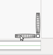
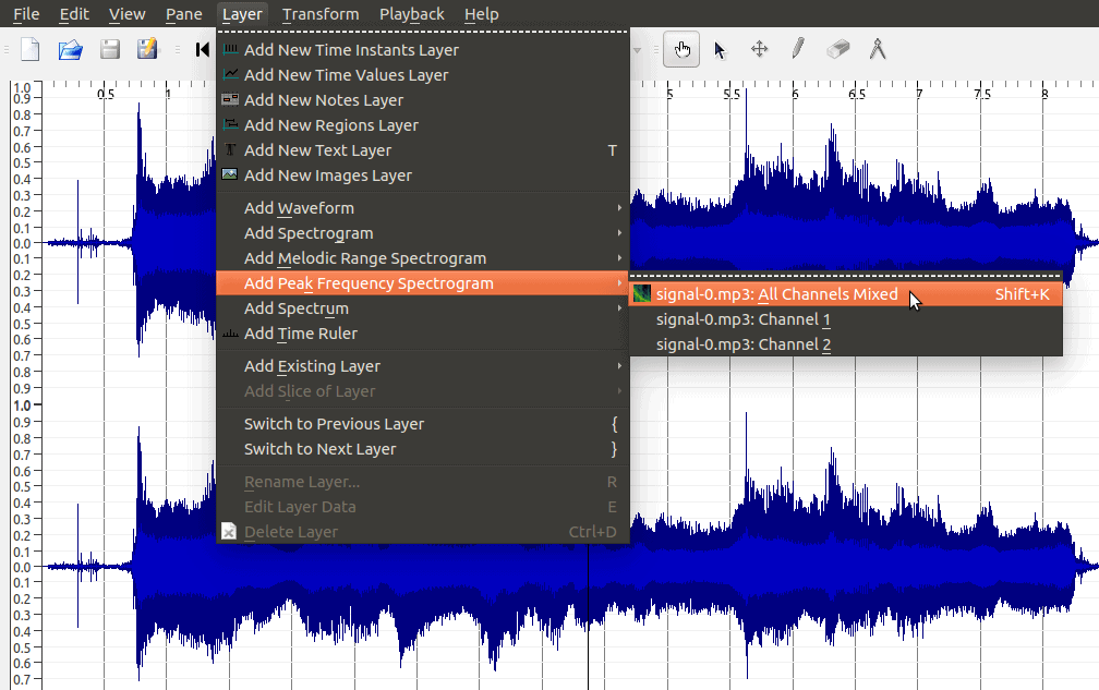
These are the horizontal and vertical zoom bars. They allow us to resize the signal we’re looking at. In this example I’ve left the vertical zoom the way it is, but widened the horizontal zoom. Then under the Pane menu, select Add Spectogram, then select your recording named in the All Channels Mixed action:
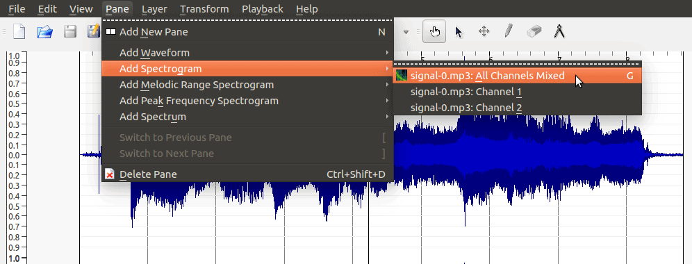
Because we’ve added this spectrogram as a pane, it puts it on the screen next to our original waveform signal:
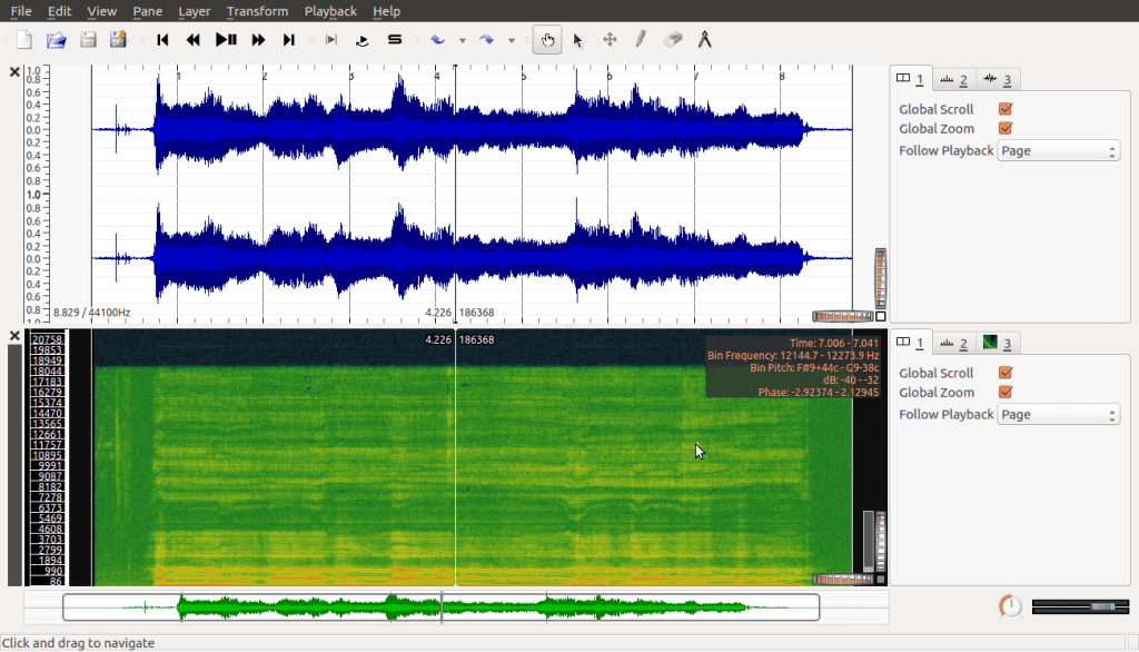
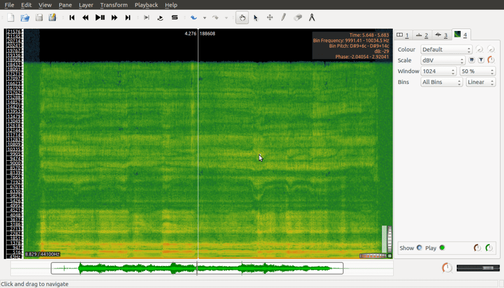
We could work with this, and there are times where it’s good to have both plots side by side, but for our purposes we’re going to work with the Layer version instead, which provides us with a full visualisation of the spectrogram. To do this we simply undo adding the pane, and instead add the spectrogram via the Layer menu, which gives us this:
Okay, so how do we read this?
A Book of Data
Explaining how to read a spectrogram can be tricky if you’ve never seen one before. Actually, the idea of a spectrogram brings up a few important concepts worth talking about, so to make this easier I will use an analogy I’m calling a book of data.
Think of a spectrogram as a book and the pages as individual spectrum plots, similar to those we explored in the Audacity example. A spectrogram splits the whole signal into many small intervals and plots each one, then binds them together like a book.
This analogy is useful in a few ways. First, it makes it easier to understand some of the limitations of a spectrogram as a tool. I mentioned in the Audacity example that the spectrum plots can be thought of as a useful tool, but not a perfect one. Since a spectrogram is made up of these imperfect plots, it follows that the spectrogram itself is not perfect either. You could say it inherits the limitations of the components from which it is made.
The second way this book analogy is useful is because it helps us remember that a spectrogram is made of many individual spectrum plots; so just like a book we can open it to any page and look at the full details. As an aside, instead of calling them pages we can call them cross sections for clarity. The thing is, unlike a book, we’ve put all these cross sections next to each other, but wouldn’t it be nice to be able to show all that data all at once? To be able to take a step back and see the bigger picture?
The third way this analogy is useful, is the very fact that it falls short. If a spectrogram were like a real book, once you closed it you could still see the pages, but only the edges—which don’t reveal any information and therefore prevent us from seeing the bigger picture of how all the spectrum plots relate. This limitation brings us to the idea of data visualization.
Data Visualisation
Data visualisation comes about when we have so much data to look at it becomes overwhelming.
These days, this is not unrealistic: the scientific world and the business world have sensors for everything now, monitoring many signals all around us, recording huge amounts of data—so much that we don’t even know what to do with it all. But we still have to makes sense of this data.
To do so, sometimes we read the data as numbers and try to find patterns, or we use fancy math formulas and algorithms to find patterns for us. But as humans we also have many ways to interact with the world, and it can be considered wasteful not to use what’s available to us, namely our senses. Sight, sound, touch, smell, taste. Our senses can help us interact with the world of information too, and even to find patterns in data we might not notice otherwise.
This is the idea of data visualisation. To be able to see the data, hear it, or feel it. To be fair, people haven’t explored many ways to smell data. I also wonder what numbers taste like? Data culinary arts to the rescue! That’s a joke by the way, there’s no such thing as far as I know, haha, but maybe there should be?
Actually, as much as I’d like to delve into data visualisation, it’s a complete subject for another time and place. The main point of data visualisation is the idea that we don’t need to use all of the data to create visualisations. Won’t that make things inaccurate though? To be honest, it’s possible, but the people who do this kind of stuff have realized over time if you learn to select and simplify the data in good ways, you can create visualisations with enough accuracy to still allow us to see important patterns. It ends up being worthwhile.
Back to spectrograms!
Reading the Spectrogram
How does data visualisation help us with our book analogy? The problem with the analogy is that each page of our book is a spectrum plot with a lot of frequency information, and when we put many plots next to each other, that information becomes overwhelming. We’d like to be able to see this information lined up next to each other so we can compare it all.
As I mentioned above, the main point of data visualisation is to simplify the information. If we play this game, then let’s brainstorm a solution: maybe we can draw on the outsides of the book? Wild idea! On a real book that is probably a bad thing to do because we don’t want to ruin the book, but with digital books we’re probably safe. So if we draw the frequency information on the outsides of the pages, we should be able to see those details even if the book is closed. What do you think? Yes? No?
This is in fact the strategy a spectrogram takes. So, yes it is. The way a spectrogram shows the frequencies is by showing them in different shades of the same color. Let’s take another look at the spectrogram, which is in shades of green:
Here you might guess, based on how it looks, that the pages are lying flat, but they’re actually upright—the book on its narrow side. The numbers on the vertical axis are the frequencies, and the horizontal axis is the recording time.
So if you look at any point in time, you can see each cross section by starting from the bottom and scanning upwards with your eyes. The lower frequencies are at the bottom while the higher frequencies are at the top. Greater amplitudes (in decibels) are lighter shades of green, and lower amplitudes are darker shades of green.
As mentioned with the Audacity example, the information presented in each spectrum plot is most reliable when it comes to frequency information. As a spectrogram is made up of spectrum plots, this applies. Also, just as with spectrum plots, peaks tell us which frequencies actually belong; peaks are observed as a flicker: from a darker shade to a lighter one back to a darker one.
The difference here is that once we identify those peaks, we can follow them over time and see how they change as the recording progresses. Of course, we can also use our computer software to help us see these peaks more clearly. Sonic visualiser offers us a Peak Frequency Spectrogram which does just this:
Adding this as a new layer we have:
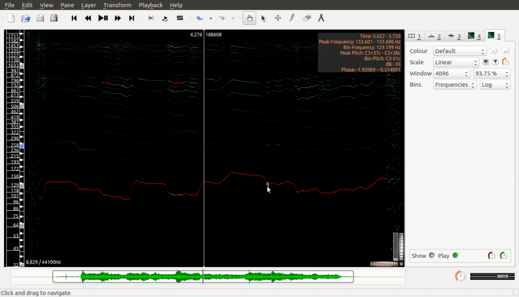
This is the same spectrogram as before but it hides all the details except the peaks; as well, the frequencies on the vertical axis are spread out in a different way now (logarithmic scale, which for us just means lower frequencies are given greater space visually and higher frequencies are condensed together). This is done to make it easier to read, especially for lower frequencies which are more important in this kind of analysis.
Okay. I think this is pretty cool on its own, but you might wonder how we apply this type of analysis? Why do all this? Haha, if you weren’t thinking that, good for you. If you were, I totally understand. Patience is a virtue, but it’s not always easy.
This kind of analysis is called Harmonic Analysis. The lowest peak in the above spectrogram is called the fundamental frequency while the higher peaks (which, if you look closely, are similar, but otherwise closer and closer together) are called the harmonics. Many sounds that occur in the real world create these patterns when you analyse their signals. Interesting examples include human voices as well as musical instruments.
Real world applications are things like sound synthesizers. Have you ever worked with software that lets you make your own piano notes? Or what about smart phone assistants, how are their voices created?
At the time of writing, there’s a famous celebrity known as Hatsune Miku, who doesn’t exist in real life, but people attend real life concerts of her music. She’s known as a vocaloid, and her voice is synthesized using this type of harmonic analysis.
So those are some applications. In practice it’s slightly more complicated than this, of course, but if you know this much you have the basics down which is a great start. Be proud of your knowledge accomplishment.
That’s it for this demonstration. I hope it helps you see the possibilities.
In case you were wondering, the transform is named after Joseph Fourier who was a mathematician/engineer in the 1800s. Beyond this, the Fourier Transform is also a starting place for our next tool, the idea of a filter.
Filter Theory
Here I’ll start by saying that filter theory builds its toolset by taking a step back and looking at the bigger picture.
We still categorize filters as processing transforms though, and in the spirit of keeping our minds open I’ll repeat what I said earlier: there’s no single best way to define transforms (or, in this case, filters). Even so, with experience and practice, people have determined that a lot of the really useful or interesting filters have common patterns, so that’s what filter theory explores, and that’s how I’ll try to describe things here.
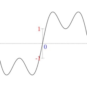
We start with what’s called the unit impulse, which is a very simple, but very important signal. The unit impulse signal is equal to 0 everywhere except at its origin, where it is equal to 1. When it comes to audio (or other 2D signals), it shows like this:

If you follow along the horizontal axis from left to right, notice how it’s a solid line until you get to the origin, where it jumps up for just that moment as a dot, then comes back down and continues on as a solid line. In the case of an image (which is a 3D signal), we have to think about our interpretation:
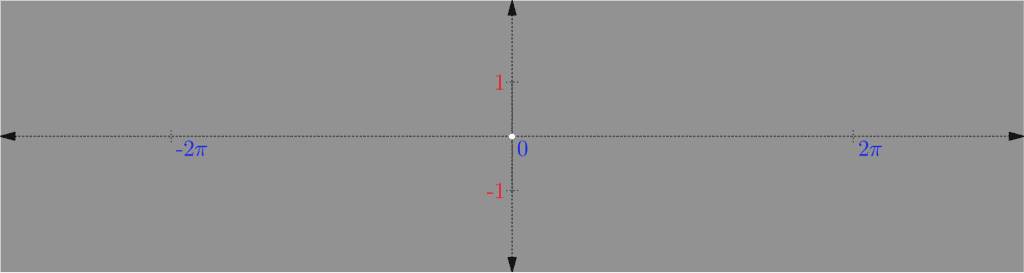
As discussed in Part One with color theory, if a signal can oscillate between -1 and 1, where -1 is black and 1 is white, then 0 would be grey. So looking at the above, the signal is grey everywhere except at the origin where it’s white (which is where it jumps up).
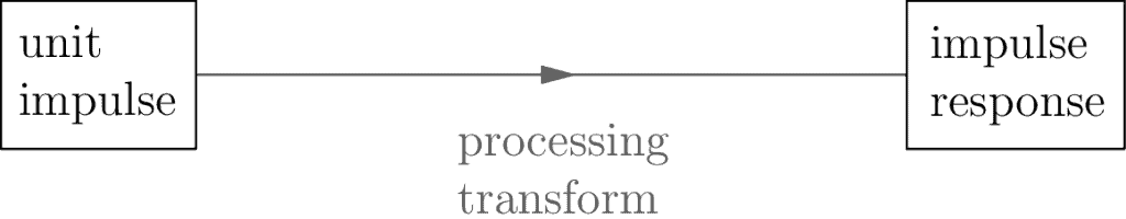
The unit impulse is important because it lets us generate another signal called the impulse response, which is even more important. I’ll explain why shortly, but to generate the impulse response you take your original processing transform and apply it to the unit impulse:
The reason the impulse response is so important, is the relationship it has with the original recorded signal:
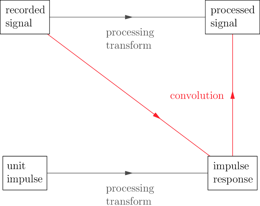
It turns out there’s a fancy math operation called a convolution which allows us to take two signals and get a third. The importance of the impulse response is that when you apply the convolution of it along with any other recorded signal, it’s the same as applying the processing transform directly. What this says is we’re able to represent our processing transform in more than one way: directly, using whatever the original definition is, or indirectly through the convolution + the impulse response combination.
What’s the value in representing a processing transform in more than one way? Here’s another question: why have more than one name? Or why have more than one description? Nuliajuk and Sedna are two different names for the same woman, but they have small differences in their meaning. Spider-Man and Peter Parker are two names for the same person, but they have slightly different meanings as well. Sometimes it is helpful to look at the same person or thing from more than one perspective, even if the difference is only subtle.
So if filters are transforms, and we have more than one way to look at these transforms, how does this help us? It helps us to understand the nature of our filters. If a filter can be viewed as a convolution + the impulse response combination, and the convolution is the same no matter what, the problem of understanding our filter now reduces to understanding the impulse response.
Once we realize the impulse response is yet another signal in the original domain, we can apply the Fourier Transform to it to see what frequencies it decomposes into:
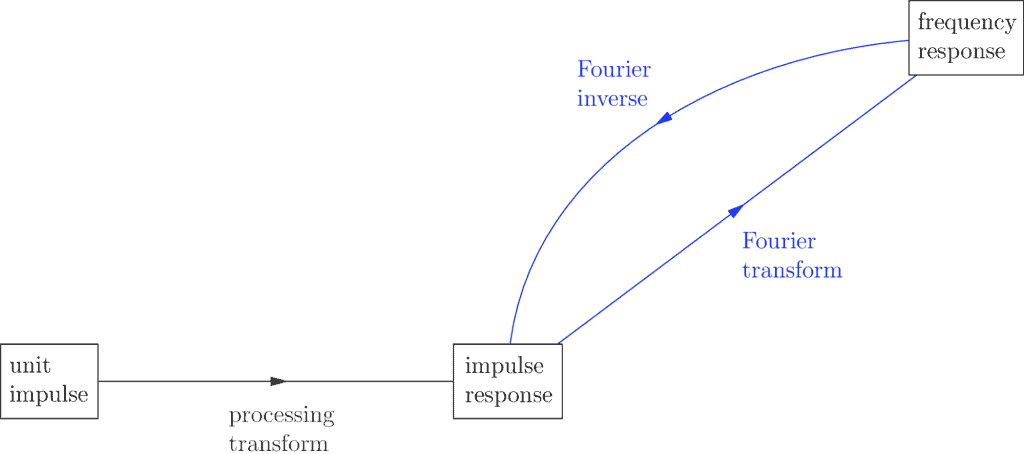
The resulting signal is called the frequency response, and it helps us categorize what kind of filter our impulse response is.
How? This unfortunately is harder to explain without deeper math, but I’ll say that because of it we can categorize filters as being high pass or low pass, among others. If you would like to explore these basic filter types further I offer the following Gimp example. For those who are really interested and intrigued about this categorization, read the advanced subsection, otherwise you can skip past it.
Gimp Example
In this example we’re going to look at an image recording—also known as a photo—and explore how we can apply two basic filter types: low pass and high pass.
Requirements
For this example we’re using Gimp, the free, open source software tool used to manipulate images. Download it here, following the instructions for your specific operating system.
Filter Time!
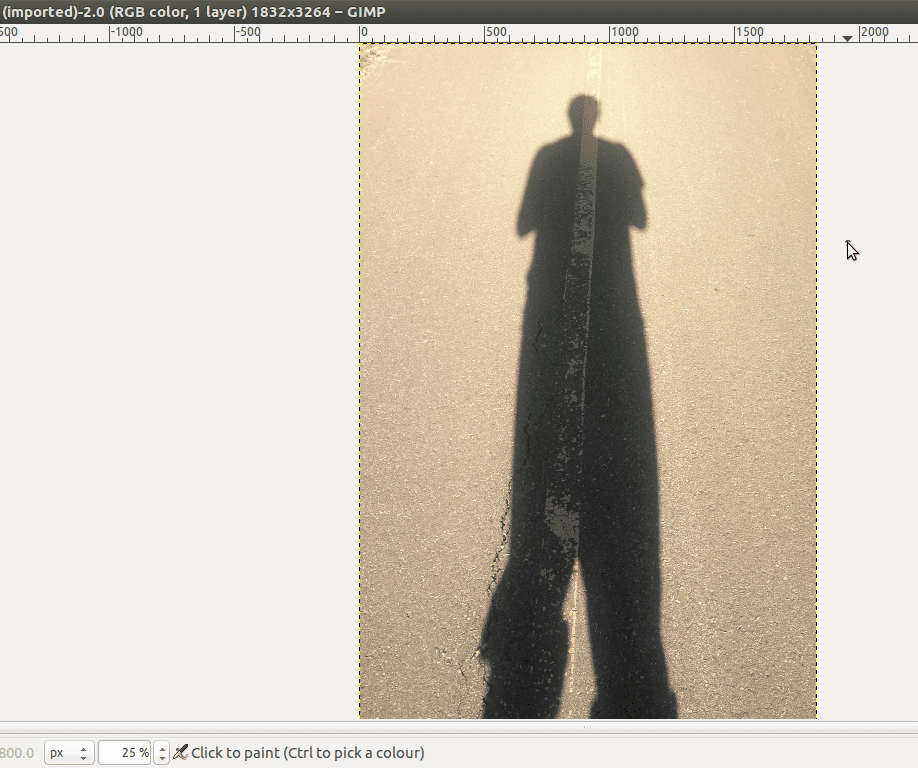
We’re going to use this image:

I took this image. It’s of me or, rather, my shadow. His legs are much longer than mine. His pant legs are inconsistently rolled up. I don’t know why, haha.
I chose this as our example because this way I don’t have to worry about getting permission from others to use this image. This is something you may take for granted, but all the images on the internet that you see every day are owned by someone, and if they posted it online, they’re giving you permission to see it, but you have to ask first if you wanted to reuse the image yourself. Here I give us permission to use, reuse, and remix this image. Right click on the image and Save Image As… to save this image to your computer.
I also chose this image because the contrast between the pavement and my shadow is strong and so it will make for a good example in what we’re doing here. Launch Gimp, and open the image file, which I will call Shadow Daniel:
The low and high pass filters
We’ll apply the low pass filter to start, but in all honesty we don’t even know what that is yet. So let’s talk.
First of all, there’s no single low pass filter, there are many. Think of it like this: an image signal is made up of spatial frequencies, so a low pass filter transforms the image by letting the low frequencies pass through while restricting the higher frequencies. The image it returns is similar to the original, just with its high frequencies reduced.
Signal processors use a fancy word for restricted frequencies, called attenuation. How do you know which frequencies will pass and which will attenuate? That depends on the specific filter. Each low pass filter has a cutoff frequency which indicates which frequencies attenuate. High pass filters work in a mirror way: they let high frequencies pass and low frequencies attenuate according to a given cutoff.
There are other filters such as band pass or even notch pass, but we won’t go into that here.
The Low Pass Filter
Okay, so if you can keep some frequencies and remove others, what does that mean? How does this change an image? Let’s apply the low pass filter to Shadow Daniel and see. To do this in Gimp, go to the Filters menu, select Blur, then Gaussian Blur…:
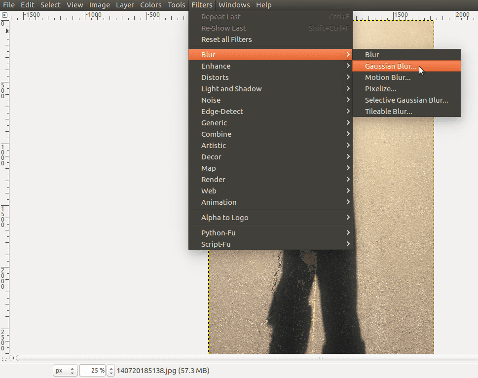
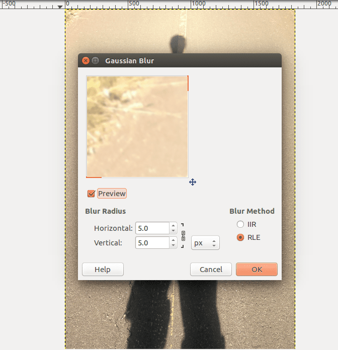
In the dialogue box that opens you can enter specific values. Feel free to play with the Blur Radius to see what happens, but for now we can leave the options as they are and click OK:

The result is almost the same image, just blurrier:

I guess it’s not a surprise given the name. Anyway, I’ve put them side by side for comparison, with the original image on the left and the filtered on the right. So why does letting the low frequencies pass and the high frequencies attenuate create a blur effect?
Edge Detection
One of the first big applications of signal processing is what’s called edge detection. So what’s an edge? In an image such as Shadow Daniel, the boundary between where the shadow begins and where the shadow ends is an edge. Looking at the foreground pavement in the original Shadow Daniel, you can see many of the individual pebbles as well as the crevices and cracks. All of these contrasts and boundaries are edges too.
What is an edge in terms of signal processing? The easiest way to say it is it’s the high frequencies in an image! How does this work? It might not be obvious at first, it certainly wasn’t for me when I first learned it, but maybe think of it like this instead: In part one we discussed image oscillations and kept things simple by sticking with one color only so that we could focus on shades. Let’s do that here as well, just for the moment.
So the idea is we’re working with the red channel of the image (using the RGB color model) which lets us focus on the frequencies that change without having to worry about how colors complicate things:

Notice that an edge in this red image generally occurs when we move from a lighter shade to a darker shade (or vice versa) very rapidly? When it comes to signals, the only way to make such a rapid transition in shade is to combine that part of the signal with high frequencies. Low frequencies are too slow when they oscillate; they just can’t contribute to the rapid change we see at the edges.
To be fair, you might have to think this over for a bit; it’s pretty mind-blowing if it’s a new idea!
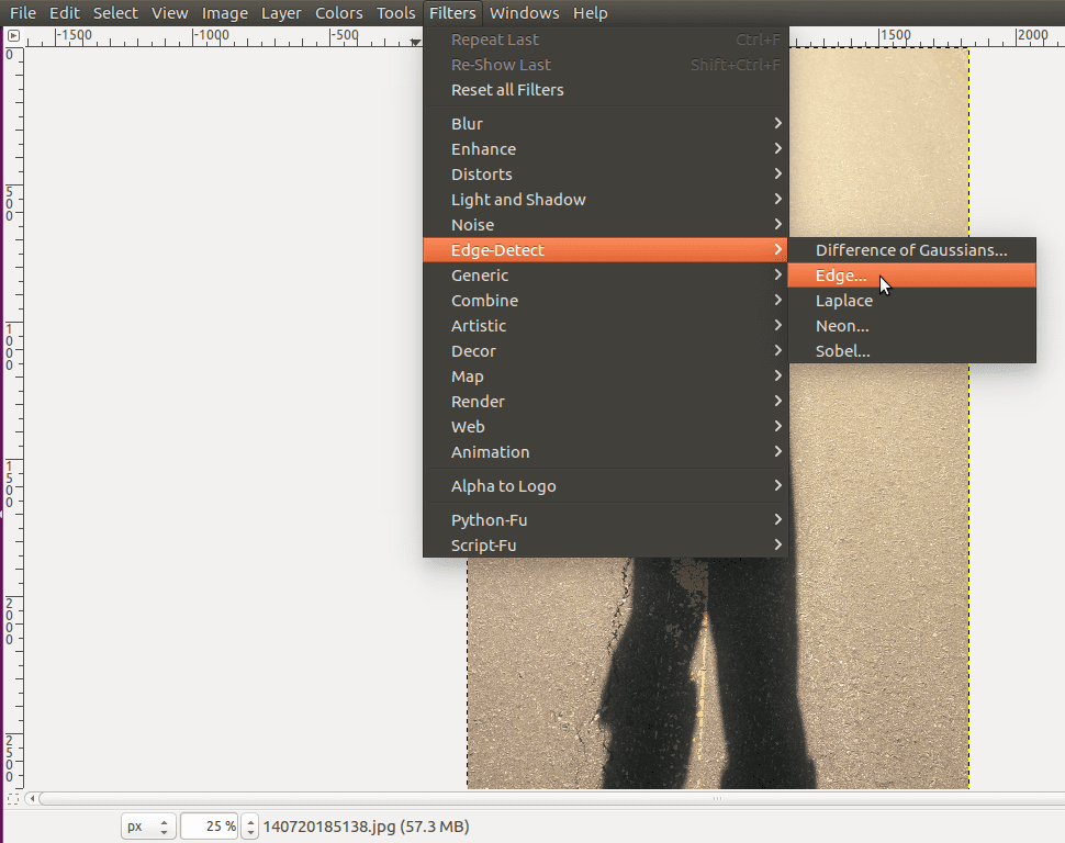
Let’s test this out on our original Shadow Daniel (in full color). Undo the blur filter, then go to Filters, select Edge-Detect, then Edge…:
This opens a dialogue box that gives you a preview:
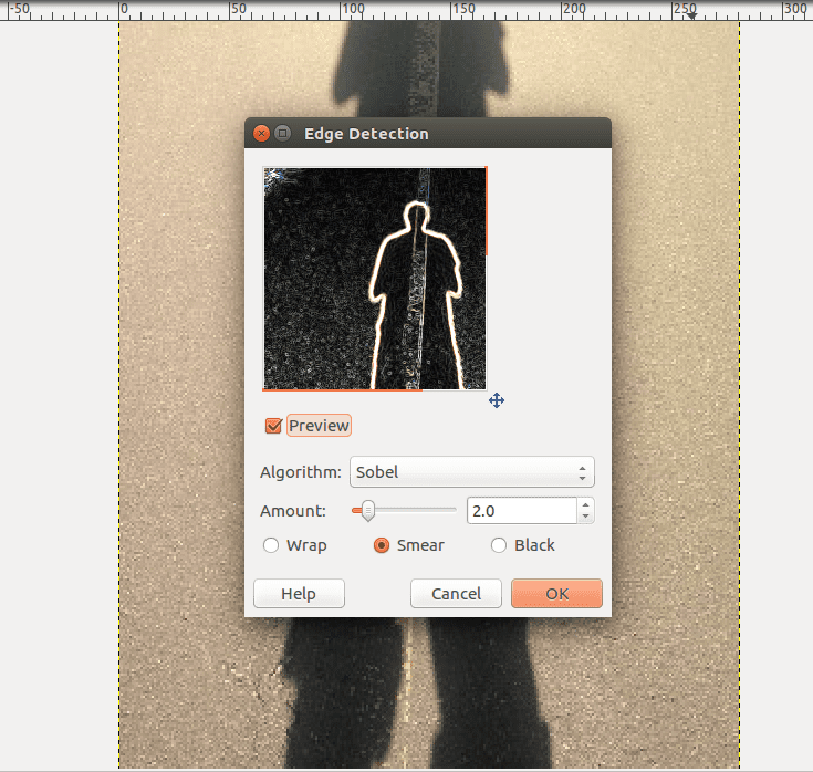
The default values are fine, so press OK which gives you:
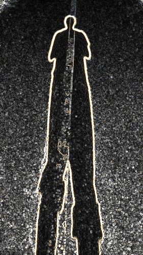
Edgy Shadow Daniel!
Notice that not only are the edges of the main shadow detected, but all the edges of the details in the pavement are as well.
By isolating the high spatial frequency information in this signal, we’ve detected and isolated where the edges in the image are. To be fair, the exact filters and algorithms are a little more complicated than using a high pass filter on an image, but these filters are often the starting point and the underlying concept of this technology.
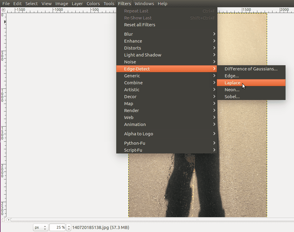
As with many tools, there’s no best edge detection filter or algorithm. It’s often a matter of trade-offs as with so many signal processing situations. It’s a matter of knowing which tools are best in which context. To give an example of this, go to Filters again, select Edge-Detect, and then the Laplace filter algorithm:
As you can see, we still get an image returned with its edges detected and isolated, but it’s different than the previous.

Most notably, the edges are more subtle, quiet even. This algorithm isn’t better or worse, it’s just a matter of the image you use it with, and what your intentions are.
Isn’t Gimp a fun tool? If you spend more time with it, you’ll see there’s much to learn. It has a steep learning curve which can seem daunting, but it’s not scary, just give it time. To realize this, it helps to know a few good stories. Things are always complicated until you know them, haha.
Beyond this, it’s largely just learning what each tool does and gaining practice and experience with it. Explore. Play. Find out. Learn. Then you can start doing interesting or useful image manipulations. Do you or your family have some archival photos you want to restore or enhance? That’s the sort of thing signal processing can help with!
The only other thing I would add here is if you do experiment and test out the tools of Gimp, use practice images or photos. If you’re using a real photo that matters to you, make a copy and only ever work on the copy. Never use the original. This is just to be safe: if you change things in a way you don’t like and accidentally replace the original photo with the new one, you can’t undo that. My advice: when editing, only ever use the original to make copies. Edit the copies. You’ll save yourself from a lot of heartache in the future.
Before wrapping up this Gimp demonstration, let’s get back to the topic of blur filters.
If you attenuate the high frequencies, you’re processing the image with a low pass filter. The truth is, attenuation doesn’t mean that you’ve made a clean cut and simply removed certain frequencies. The actual truth is, because of the hidden math behind the Fourier Transform, attenuation means we’ve only reduced those frequencies.
What’s more, it’s not even a clean cut, it’s more of a gradual tapering off: so even if you specified a low pass filter with a cutoff of 1500 Hz, it doesn’t completely cut it off at 1500 Hz; it starts a bit lower, perhaps 1250 Hz and gradually reduces until perhaps 1750 Hz (these are made up numbers to give an example).
To summarize: blur filters attenuate the high frequencies in a gradual way, and so they smoothly reduce the sharpness of the edges. The low frequencies are allowed to pass, so slower oscillations still occur, and that gradual tapering creating a smooth transition which makes things look blurry. High pass image filters mirror this process but with low frequencies being attenuated. This filter effect is called sharpening. When it’s done right, you can actually make the image look sharper this way, which is pretty neat.
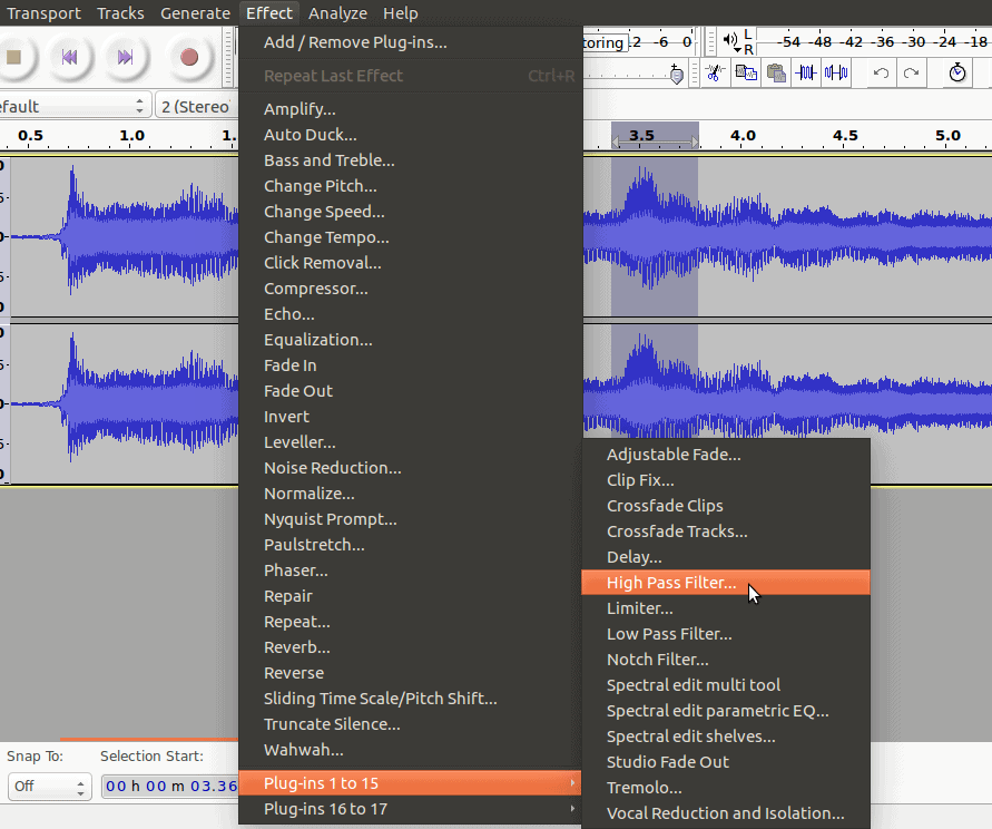
Before we finish here, I thought I’d quickly add one extra example using Audacity. This is informal, so I’m just going to assume you have Audacity if you’re this far into the module. If not, you can return here for the basics.
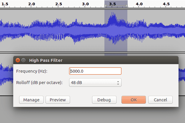
How do low and high pass filters affect audio signals? Go to the Effect menu, select Plug-ins, and High Pass Filter…:
This will bring up an option dialogue:

Here Frequency is the cutoff, and the Rolloff is what I was talking about with the gradual tapering around the cutoff (which applies to audio as well). If you want a very strong taper, use a higher decibel output. I used the highest option at 48 dB in this example. Lowering the rolloff value will make the effect less noticeable.
Try it out! With the high pass filter in particular, you should notice the high pitch (frequency) sounds remain, while the low pitch ones are less noticeable, or otherwise gone. Test it out with different cutoff points. Just remember that humans generally only hear frequencies up to about 20,000 Hz so there’s no point it cutting off higher than that. Have fun!
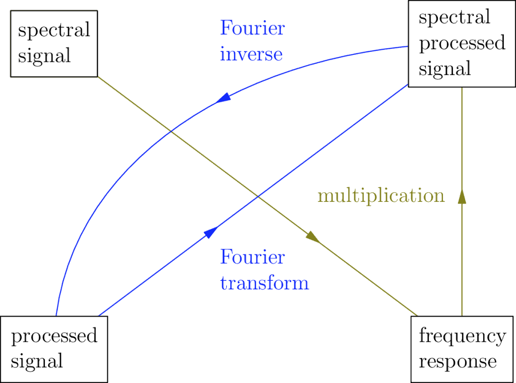
Convolution And Multiplication (Advanced)
If you read this part and don’t understand, don’t worry, it won’t affect anything else in this module.
How does a frequency response signal help us categorize a filter? It won’t make much sense here, but if you go into the underlying math you’ll find out the convolution has a kind of mirror relationship:
This is connected to the relationship that allows us to use the convolution + the impulse response to get a processed signal from a recorded one. It says that in parallel we can use multiplication + the frequency response to get the equivalent spectral processed signal from the spectral signal. Don’t worry, it’s not an obvious thing until you study it, even for me. Sometimes that’s how it is, don’t let it scare you off.
The deeper meaning you find out is that because of this multiplication relationship, the behaviour of a filter is determined by the shape of its frequency response, which is how and why we choose to categories filters as high pass or low pass or some other variety.
Returning to the main section, we’re actually winding down our introduction to filter theory. The main takeaway is this: filter theory is only one tool among many. It is a powerful tool, but it is still just a tool, meaning it might be useful in some situations, but less so in others.
If this is the case, then what are the limitations of filter theory? The main thing to know is that not every signal transform can be understood using filter theory. Technically this theory only applies to transforms that are Linear and Shift Invariant. These are mathematical definitions which just say that these transforms have particular properties.
In practice I’m willing to say the vast majority of signal transforms that people find interesting either have these properties or are constructed from simpler filters that have these properties, and so filter theory remains incredibly relevant. Generally, you don’t have to worry about the underlying math assumptions.
Beyond this, many real world filters are more complex than basic low pass and high pass filters. The filters you see in social networks and apps such as Instagram, or Snapchat, etc. are complex algorithms made up of many filters. Some are Fourier based, while others are not. The important thing to remember is that what I’ve introduced here is meant to give a basic language to be able to navigate the world of filters you might encounter in the future. I hope it helps.
Module’s End?
That’s it for the main content of this module: Signal Processing, both parts one and two. I would like to leave off by briefly introducing the technical landscape one will need to learn when delving deeper into this subject. Why? Because this discipline is largely considered part of engineering so if you want to get really good at it, there’s no way around this. It would be irresponsible of me and disrespectful to you if I did not open these paths for you to explore and grow, which has been my main goal in writing these modules in the first place.
The Engineer’s Way of Mind
First of all, there’s a few technicalities I glossed over throughout these modules I should mention here.
One of the biggest is the relationship between perception and objective measurement. To keep things at an intuitive level, I freely swapped terms like “frequency” with “pitch”, or “loudness” with “decibels”. These are strongly related ideas, but they’re not identical. Frequency in Hertz and amplitude in decibels are objective measurements. We have sensors which accurately describe them. On the other hand, pitch and loudness have more to do with human perception and, because of this, are a bit more flexible or heuristic.
Another thing I didn’t get into is the idea of numerical relativism. In a way it’s similar to human perception in that it’s more flexible and fluid. For example, to describe color gradients and color oscillations I claimed black was -1 while white was 1. This is an example of numerical relativism. We assigned these values by convention, but there’s no reason we couldn’t assign alternate numbers. In situations like this, it’s not as important that the exact number -1 is assigned to black, or that 1 is assigned to white, but that the numbers assigned preserve the relationship we’re trying to describe. For example in other contexts, black is often assigned 0 while white is assigned 255.
As for the engineer’s way of mind: there’s no simple summary, but it’s all about learning trade-offs and how to work with them. When you’re a software engineer, you have to consider the trade-off between memory cost and computation (cycle) cost when you design and write your apps. With Fourier analysis, one of the biggest trade-offs is between time (or space) and frequency resolution. It always comes down to context.
Often there is no universal best solution, so it becomes an important skill to learn how to identify the context, because it informs what the final trade-off will look like. It’s important to be able to justify your decision to yourself and to others. Keep in mind though, that this skill generally comes after learning the basics, just know that once you’re comfortable with those basics you still have more to grow; there will always be more to learn. Life is a lot of work.
Links for Further Study
If you decide to pursue signal processing on your own, I have collected together three links to start you off. They have helped me very much. Also, even if you plan to be an engineering student and you study these things in school, it might be beneficial to do some prepwork and familiarize yourself beforehand. The information in these links can help with that as well.
The first link is the website for Julius Orion Smith, a professor of audio signal processing at Stanford. As an aside, I’m told they have a very good music program there. In any case, this site is a really good resource if you’re comfortable enough with high school math to challenge yourself further.
Audio Signal Processing Online Textbooks
I recommend this site and its textbooks because it teaches the material from foundations. It gives a good introduction to complex numbers, which show up a lot because they are strongly connected with circles and rotations—and are thus a good language to describe oscillations. It also gives a good introduction to linear algebra. Don’t rush learning linear algebra too quickly, it doesn’t just exist to serve signal processing, it’s used in computer graphics, and if you ever want to learn about AI and machine learning, it shows up there too.
Finally, truthfully, if you do read the textbooks on this site I should warn you there is an overwhelming amount of information in them, especially if all of this is new to you. Don’t worry, you’re not expected to learn it all at once. There’s no rush. Learn a bit at a time, and continue having fun remixing audio recordings.
A MOOC is a “Massively Open Online Course”. Universities offer them in partnerships with websites like coursera, or edX, or others. Think of them as online textbooks in video format. They offer online degrees you can choose to buy, but it’s not necessary (and there’s no guarantee an employer will even recognize a MOOC degree). Most of the courses are free.
MOOCs are a good place to learn because of their video format, and they have simple exercises and quizzes you can choose to participate in to help you learn the course material better. This first MOOC is one I took myself:
This MOOC is very well done and I learned a lot from it. These MOOCs are a bit more advanced though, and there is a lot of math and programming involved. If you decide to learn signal processing from MOOCs I recommend audio signal processing first, as it teaches the material in 2D which prepares you for image and video signal processing as they involve 3D and even higher dimensions.
The second MOOC I recommend covers image and video signal processing:
Image/Video Signal Processing MOOC
I found this MOOC much more advanced and at times hard to follow. The math is definitely too advanced for a beginner, but if you’re just trying to get the bigger picture of what kind of things you might learn it’s a reasonable place to start.
I also want to note that you don’t have to take my exact recommendations for these MOOCs. If you go to any of the MOOC sites themselves, you can browse all the courses they offer and choose your own. There’s no penalty or consequence to signing up to a course you didn’t pay for, and you don’t have to complete it if you don’t want to. Try it out, and see if it’s a good fit for you.
The only potential drawback about MOOCs is if you’re in a community with limited or expensive internet, the video format might become a problem. Discuss options with friends or others in your community to solve any problems you might have with this.
With that said, I have found in general the MOOC sites themselves let you download the videos, and copyright usually isn’t an issue if it’s for educational purposes, so one possible option could be to download and save the videos for reuse, especially if others want to take the MOOC as well.
Conclusion
Thank you for letting me share my knowledge here with you.
The main goal of this module has been to describe the larger relationships that exist within signal processing. If you delve into the deeper material, you will find there’s quite a lot to learn when it comes to individual details. In learning these overarching relationships first, it should help you to navigate those details with greater motivation, understanding, and intuition.
As for these larger relationships, I will summarize them here in a single graphic that puts it all together:
These diagrams can get pretty complicated. To simplify reading this one I’ve changed my convention a little from the previous: instead of including both directions of a Fourier Transform, I have instead shown them as a single line without any arrows (no arrows means you can go either direction), and I just use the word Fourier to mean both.
I hope you enjoyed Signal Processing, and that you continue with it, but if not I will add this: after reading through these modules, you might decide this isn’t the path for you, and that’s okay too. There are many paths for your success, my only hope is that you will start to think critically about the technology you use. My intention was not to interfere with your inner way, only to resonate with it and maybe light an intellectual fire for you as you move forward.
Like life: goals, success, and learning are ongoing. Pijariiqpunga.
Think of it like learning to use a powerful tool: if others are using it and they say it’s good, it’s probably worth learning. But it’s not the only tool, and it’s important to never forget that. Keep an open mind to the possibilities, it’s how we grow as students and makers.