Introduction
The Inuktitut word for the Internet is ikiaqqijjut. It translates as: the tool to travel through layers. Web browsers are the main tool that lets us travel through these layers.
The first thing to know about web browsers is that there’s more than one. The four major browsers are: Firefox, Chrome, Safari, and Opera, but there are others still. Chrome is currently the most popular, but in the following examples, we use Firefox for Desktop. These browsers are different brands offered by competing businesses, or are made for different kinds of computers such as laptops or smartphones, but otherwise they behave the same. It is their similarities that we’ll discuss here. Web browsers let us view web sites, which are made up of web pages. They’re called pages because they resemble pages in books or magazines, but it is only a small resemblance because, as we will see, web pages behave in many ways that books and magazines are unable to.
If you’re reading this it means you’re already using a web browser looking at a web page, so you probably know a little bit about the Internet or the Web, but let’s review the basics just in case, so that we don’t skip anything important.
Figuring Out Where We Are
Let’s look at the following web page:
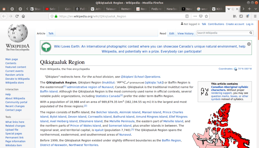
The above image is a “screen capture” (also called a ‘screen cap’, ‘screen shot’, or ‘screen grab’) of the actual web page. The page itself is located at the following internet address:
The above address is a direct link to that page, but often links are indirect, meaning they’re not displayed, but instead are hidden and replaced with regular words:
Notice though, if we click the link and go to the page, that this is the address that is displayed near the top of the browser (highlighted in red):
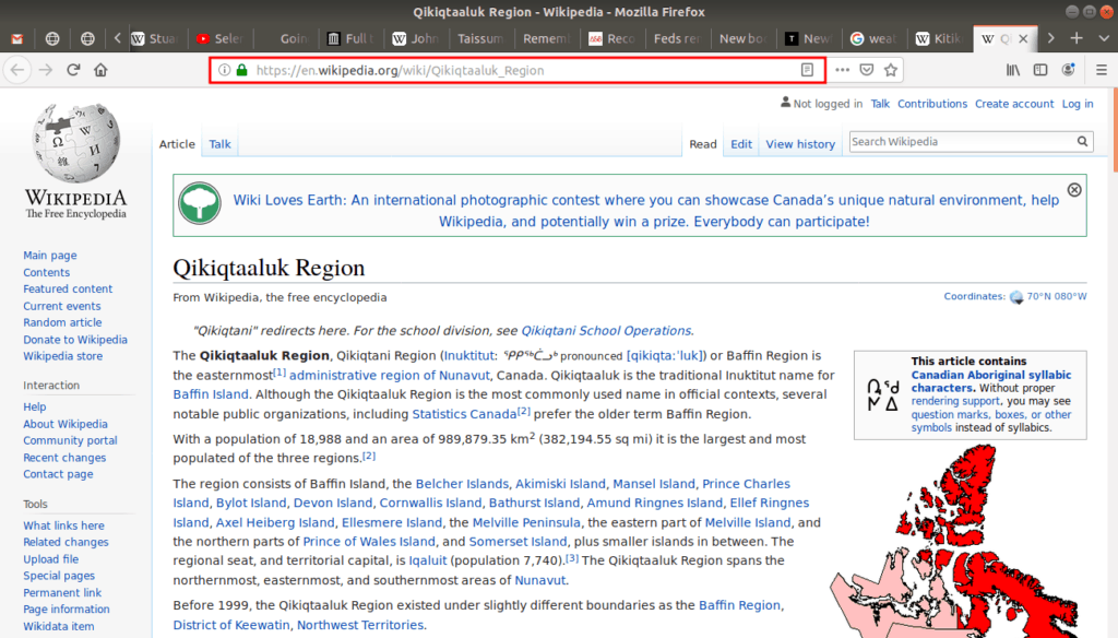
This highlighted rectangle where the address is located called the address bar. The address inside it is called the URL which stands for: Uniform Resource Locator.
If you want to know where you are, just look at the URL in the address bar.
Moving Around A Page
To move around a single page use the scrollbar on the right side of the browser window:
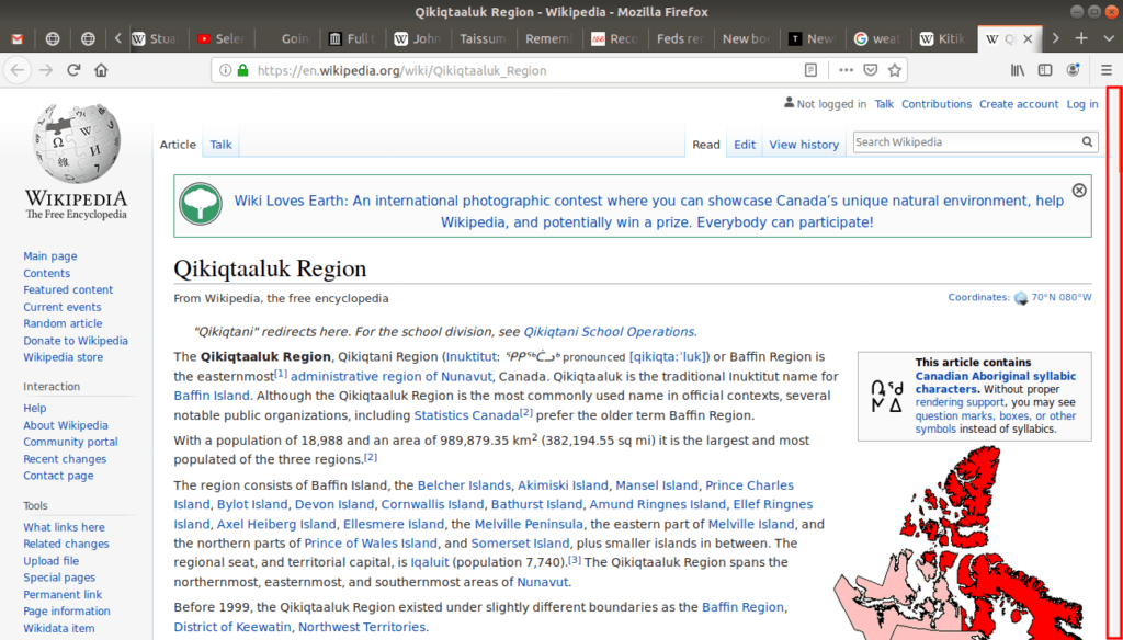
Most browsers also allow you to scroll the page using the Down and Up arrows on the keyboard. You can scroll faster (or one “screen” at a time) with the PgDown and PgUp keys. And you can move to the very bottom of the page with the End key, and back to the top with the Home key. The exact names on your keyboard may be different, but most keyboards have these key buttons.
Next, many web sites and web pages provide a navigation menu as part of the page itself. There are no rules about how these are formatted, or if they’re included on a page at all, but often they are on the left hand side, which is the case for our example page:
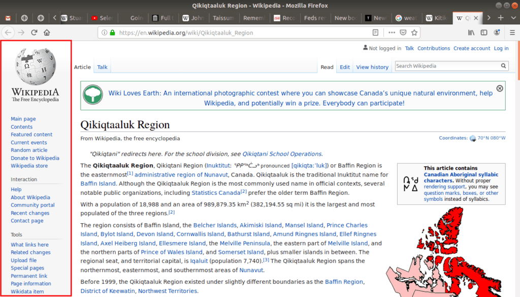
If the web page or web site is quite large, the navigation menu can resemble a table of contents. Some pages even include two navigation menus, one for the page and one for the site. Our example page is part of a site called Wikipedia, and its navigation menu helps you explore the site rather than the page.
Finally, there is another way to move around a page. As these pages are made of text, web browsers let us do word searches. To access this search tool, go to t he Edit menu, and click Find in This Page:
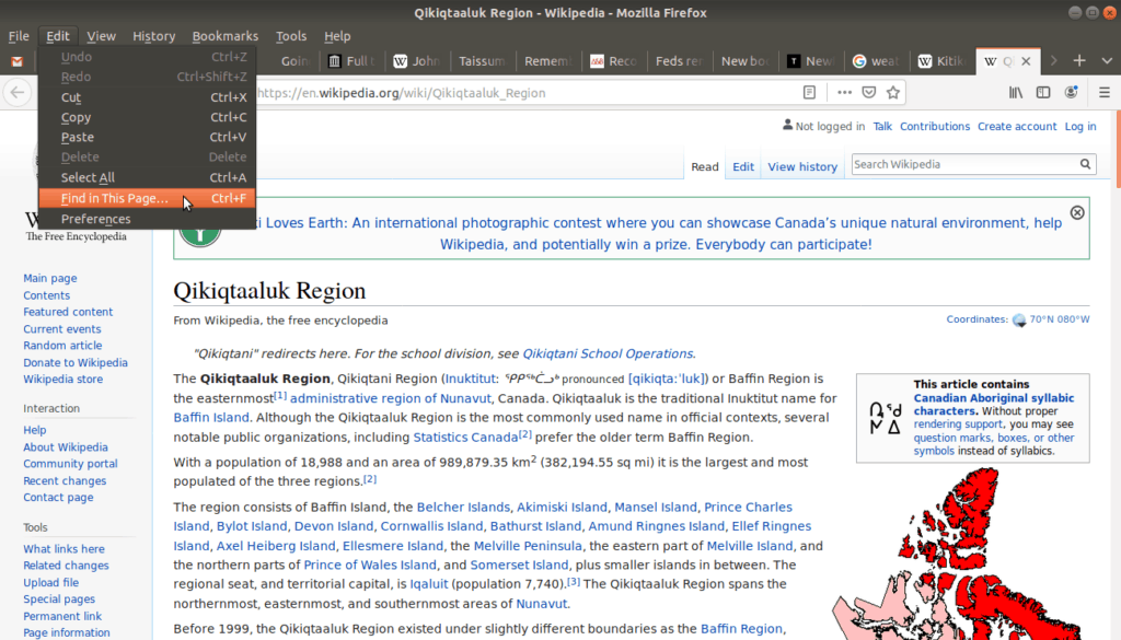
Which opens a search bar in the bottom left corner:
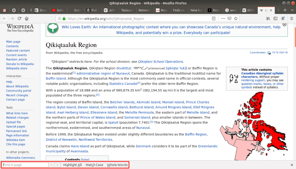
Enter a word or text, and it finds it on the page. Try it out!
Moving Across Sites
To visit another web site or web page, enter the addresses into the address bar, or use a hyperlink, or link for short. These links, when clicked, tell our browser to take us to the connected address.
For example, if we scroll down to the bottom of our example page, we’ll see an External links section. Hover your mouse cursor over the link to see what happens:
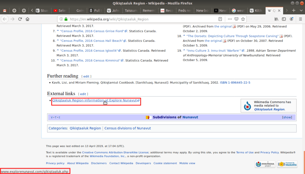
Notice that the link reacts when the cursor hovers over it? This reaction could be a change in link color, the size of the text, or, in the case of our example, the link becomes underlined. These are all different ways to give you feedback about where you position your mouse. If you click on the link the browser redirects to that address.
Tip: Also notice that when you hover above the link the browser shows the connected URL address in the bottom left corner? It is useful to read the address before you click the link, as it tells us a bit about our destination address. This will be useful to know for our discussions on privacy later on.
Now that we know the basics of hyperlinks and how to move across sites and pages, let’s explore the browser’s navigation toolbar:

From left to right, the push buttons in this toolbar are: Back, Forward, Refresh, Home. To return to a page you had just visited, click the Back button (left arrow). Then, if you went Back but changed your mind, click the Forward button (right arrow). The Refresh button reloads the page, and the Home button opens the default page that loads when you first start your browser. We’ll discuss the idea of loading and reloading later.
Tip: The Back and Forward buttons have keyboard shortcuts: Back is Alt + Left Arrow, while Forward is Alt + Right Arrow.
Hypertext and HTTP
If a web page is made up of text, then a page which includes hyperlinks in the text is called hypertext. If you look at the URL addresses, most of them start with http or https. The acronym HTTP is short for Hyper Text Transfer Protocol. This protocol is the special way that computers connected to the Internet talk to each other. When it comes to privacy, which we will discuss later on, you’ll want to pay attention to see if an address is HTTP or HTTPS.
User Friendly Design
Web browsers are powerful tools, they provide us with many options and give us many different ways to use these options, but this also makes them complicated tools. The reason they have so many options has to do with how different cultures think tools should be designed.
In the Inuit Way, everything has a flow, and you do your best to not interfere with that flow or the inner way of others. When you carve a piece of driftwood or soapstone, you are shaping and designing it, but really it’s a negotiation because each piece of wood and stone has its own flow.
Southern design sees things differently: rather than adapting around the natural flow of things, humans are put at the center and things are adapted around us. This also applies to web browsers. The thinking is, to make a web browser accessible to the most number of people and their diverse needs, many options and alternative ways of doing things need to be provided.
This mode of design thinking is called accessibility thinking. To think this way, it helps to ask ourselves, when designing a tool: how can we make this tool accessible for everyone to use?
For example, some users might find the text on the screen too small or too large, so there is an option to increase or decrease the size of the words called Zoom In and Zoom Out. We call the screen size of the words their font size.
To access the Zoom options, go to the View menu, then select Zoom In or Zoom Out:
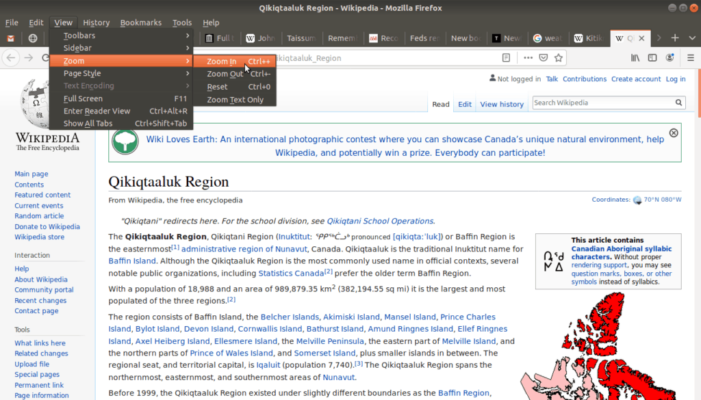
Tip: Zoom In and Zoom Out have keyboard shortcuts Ctrl + [+] and Ctrl + [-]. This means the font size can be increased by holding down the Ctrl key and pressing the + key. Or decreased by pressing Ctrl and -.
If we were to zoom in four times (4x), the text would be 150% bigger and would look like this:
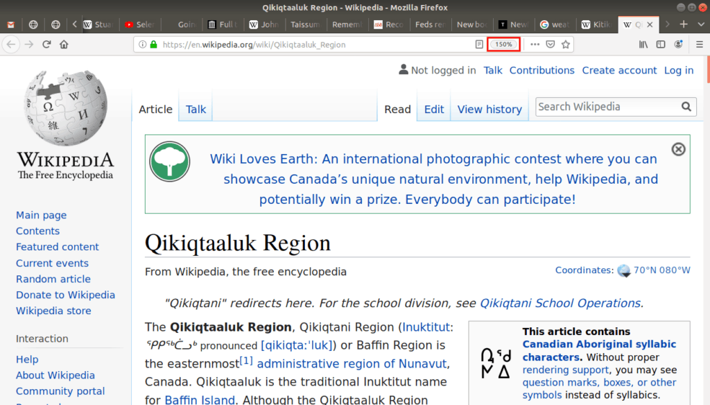
Notice how the text is much larger? Also, the web browser displays the change in size as a percentage to the right of the address bar (highlighted in red in the above screen shot).
Another example of accessibility is the screen reader. Users who are visually impaired should be able to access the Web like everyone else. Screen readers enable web pages to be read aloud to make them accessible to visually impaired people.
Tabs
Our browser not only provides options for accessibility, but also for our common habits. For example, my common habit is to read part of a web page, and then go to another page before finishing. Often I will want to return to the first page later, but this would be tedious if we could only view one web page at a time.
The solution to this is tabs. Tabs allow us to have many web pages open at the same time. Then you can easily select which tab, or which page, you’d like to look at. In the following screen shot I’ve highlighted all of my tabs, near the top of the browser:
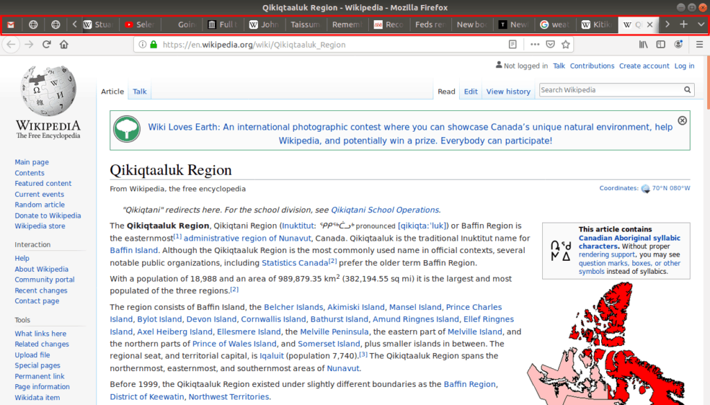
Having this many tabs open at once is probably a bad habit. I don’t encourage others to follow my example, but I acknowledge that this is my way. Some tabs are so important or frequently visited, we want to keep them separate from others; we call these pinned tabs:

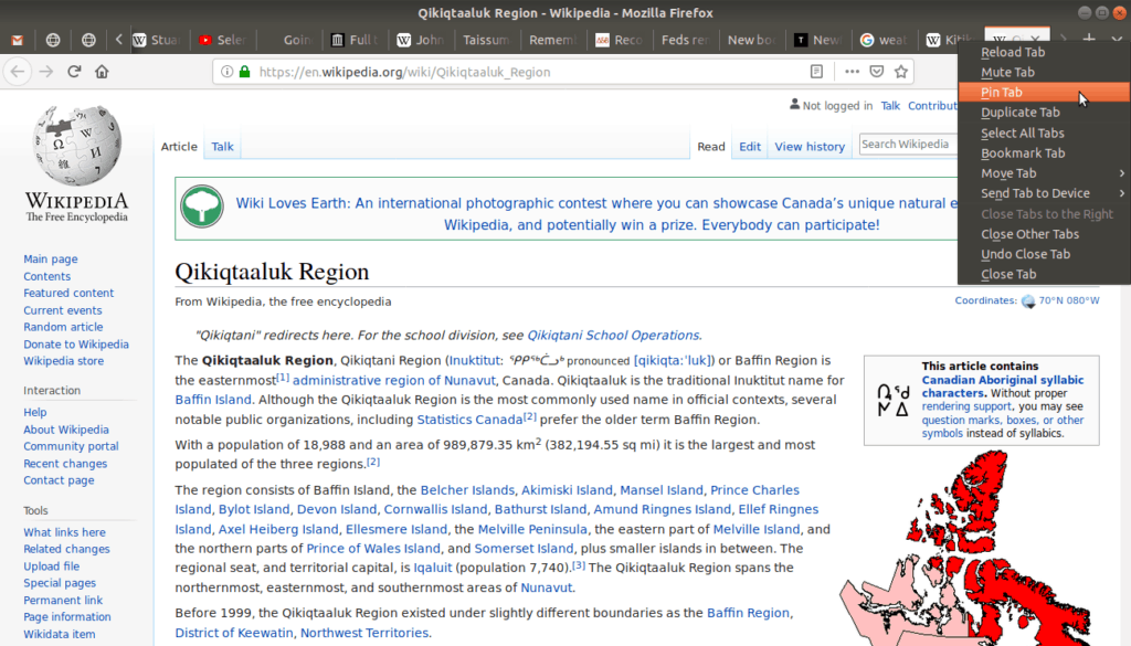
Pinned tabs are meant for pages we visit often, perhaps a website with daily news or weather. To pin a tab, right click on the tab and select Pin Tab:
Unpinned tabs are generally pages we will visit just once, such as news articles or Internet videos:
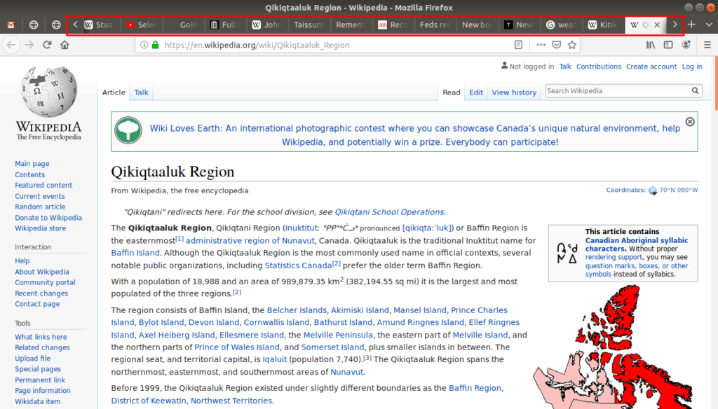
The left and right arrows [<] [>] on either side of the unpinned tabs allow you to navigate and scroll between them if you have many open.
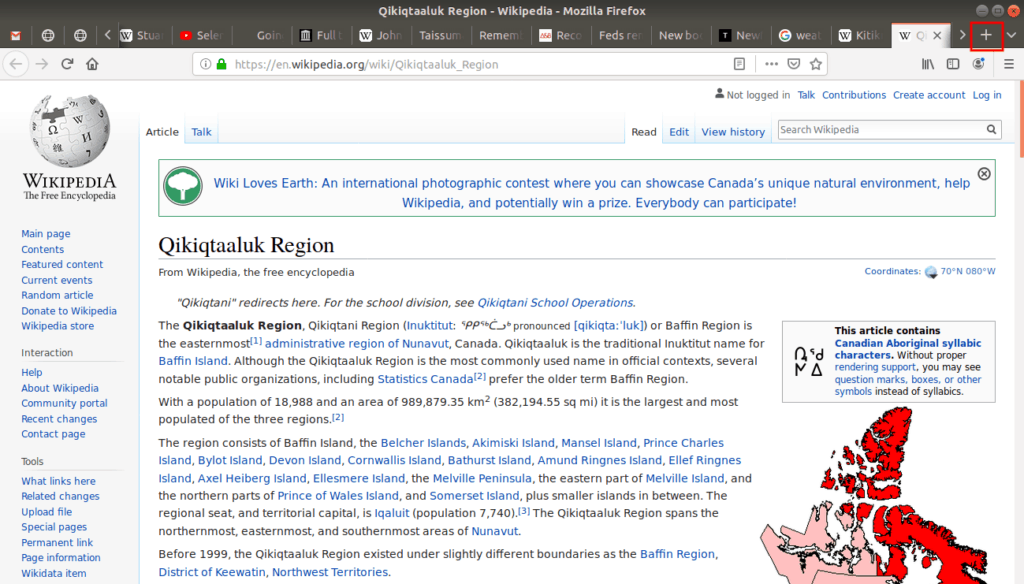
To open a new tab, click the [+] button on the far right:
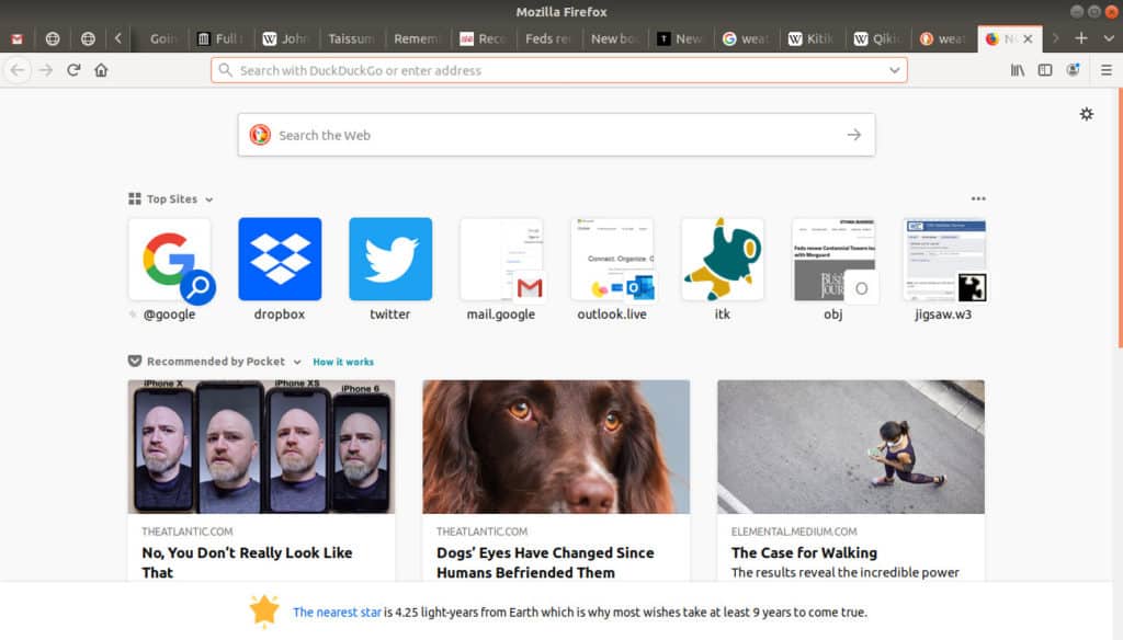
It opens a new tab with the browser’s default home page:
Tool Tips
There are so many tools, options, and shortcuts, it’s hard to remember them all, so web browsers give tips—short explanations—about what a tool does.
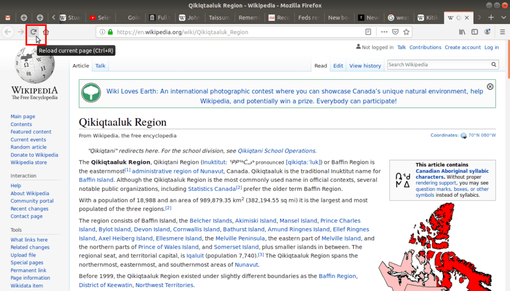
To activate these tips simply hover over a button without clicking. After a few seconds of hovering, keeping the cursor still, the tip appears describing what action that button performs. For example, if we hover over the “curved arrow” button, the tip tells us this tool will Reload current page. This particular tip also reveals that this button has a keyboard shortcut (Ctrl + R):
User-friendly design is highly valued on the Internet, so not only do web browsers provide tool tips for the tools they offer, but web sites and web pages (which are not part of the web browser) often offer tool tips and link tips as well (sometimes called “link titles”).
In our example page if we hover over the hyperlink Nunavut, a short description of that page pops up:
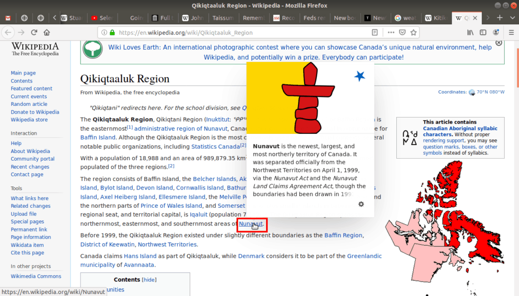
This link tip might provide helpful information, helping a user decide if they want to go to that page or not.
Web sites also offer link tips in their navigational menus:
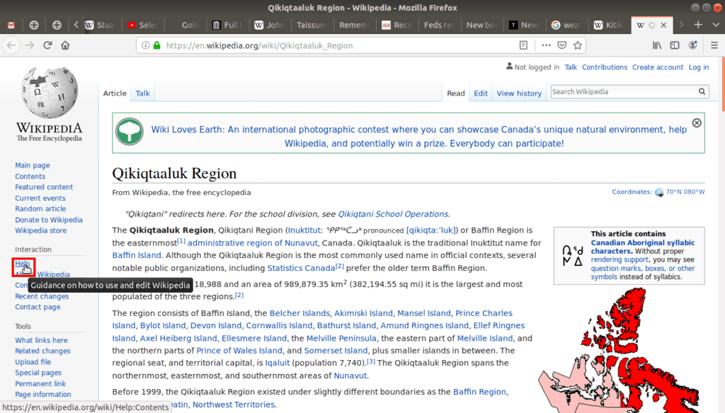
Keep in mind that while browsers usually offer tool tips, web sites are not required to. It’s up to the people who make the pages. Sometimes there will be link tips, sometimes there won’t. Either way, tips provide helpful information, so if you’re unsure of something, just hover over the tool or link and see if there is a tip for you!


