Section Navigation
Introduction
What is UI? UI is an acronym for User Interface. It is the visual look and feel of the system that controls the product. This includes the look and feel of buttons, menus, text, motion (e.g. how a menu moves in and out of the screen) and more. For digital products such as computer programs, games, mobile applications etc, this is referred to as the Graphical User Interface or GUI.
What does a User Interface Designer do? A user interface designer is concerned with the appearance of the project’s interface – how it looks (aesthetically) and how elements are visually and spatially connected. UI designers follow many of the same design rules as a graphic designer; making adjustments depending on where the project will be used (mobile screens vs. computer screens; touch interfaces versus mouse or remote controllers) and the type of project. Unlike a graphic designer, the work of a UI designer is generally limited to interface work (buttons, menus, icons etc).
Learning Goals
Students will learn the terminology of User Experience and User Interface, how they are different from each other and the places they intersect. They will look critically at a favourite application or game and dissect the UX and UI aspects, find areas that are done well and why, and areas that could be improved. In a second, alternative activity, students will work in groups to design their own mobile app elements based what they learn from user research.
Vocabulary
Useability - Useability is the determination of how simple user interfaces are to use
Wireframes - A barebones, simplified graphical representation of an application or product. These are generally devoid of colour and graphical embellishments and are meant to communicate the main behaviours and flow of the application or product.
Target Audience - The main audience you intend to use your product or application.
Prototype - A simple working model of a product built as a sample to prove a concept or to ensure functionality. It is the phase of development in which user experience, and early user interface and graphic treatments are reviewed before committing to a specific direction for the entire product.
Curriculum Links
This module provides an opportunity to address curriculum expectations in the Arts, Communication Technology and Computer Studies. Students will be introduced use critical thinking and communication to build a user experience. This lesson is geared to students in Grades 9 to 12.
Guiding Questions
Ask the group some questions: Have you ever used an app, played a game or used a product that looked good, seemed to be a nice idea, but was hard to use or just felt “bad”? How did that change your feelings about the product?
Background Information
A User Interface designer will use information and considerations from a UX designer and all the information they have learned about the users during their research. For example, the users they are creating the project for (their age, preferences, geographic location, education level, income, etc) as well as any brand icons, colours etc. that ensure the product feels it is in the same “family” as the client’s other products (that is, it conforms and aligns with the visual and brand identity). UI and UX designers work closely together and aspects of their jobs often overlap. Things to consider when designing a product from a UI point of view:
- Visual Space – assess how much visual space will there be to place all the required elements, given the intended platform (mobile screen? Kiosk? Desktop monitor?).
- Colour and visual harmony – UI designers will find an appropriate colour scheme and layout to fit a project’s mood or that will appeal to the target demographic. They also often have to work with a company’s colour scheme – like red for Coca Cola. Regardless, colour choices should make items easy to find and understood. Text should be easy to read and the colour scheme should be pleasing to the eyes.
- Colour and visual harmony – UI designers will find an appropriate colour scheme and layout to fit a project’s mood or that will appeal to the target demographic. They also often have to work with a company’s colour scheme – like red for Coca Cola. Regardless, colour choices should make items easy to find and understood. Text should be easy to read and the colour scheme should be pleasing to the eyes.
- Clarity and accuracy – The information being displayed should be correct, and clearly understood. For example, a ‘Save’ button’s function should only be saving a file!
- Balance – UI designers make sure the object or screen being designed has its elements aligned and evenly spaced making it more harmonious for a user to look at and quickly understand, especially when many options are displayed at once. They will make suggestions on how options can be grouped or broken up to make it easier for a user to navigate through. (For example, should a music volume slider be found on the main menu of a mobile app? What about a quick volume on/off toggle? Should anything to do with volume be on that app at all?)
- Consistency – UI designers ensure that elements in the interface are consistent across screens (colours and icons etc.) and their placements and sizes are consistent with the message they are working to get across.
What is UX? UX is an acronym for User eXperience. It is a person’s interaction with and experience of using a product. The designer’s intention is to create an easy, intuitive experience; an interaction that adds joy to a person’s life, and does not cause frustration. This involves a thorough understanding of a user’s needs, preferences, and habits. A good user experience makes users want to use your products, stay on your websites and tell friends and family about those good experiences. User experience is often talked about in the digital realm but affects many aspects of our lives, from the dashboard of new cars, buying coffee from a kiosk and even the flow through an art gallery exhibition.
What does a User Experience Designer do? A user experience designer is concerned with the feel of the project – how it feels to a user who is experiencing it. Their job involves a lot of research into what the user needs, which can be done through interviews as well as observation of individuals using similar products and devices. What a user experience designer is trying to achieve is to make using a product an easy and frustration-free experience, that they want to use again and again, instead of choosing a different product. Individual users, as well as the client, may have competing needs, and the user experience designer tries to come up with the best solution for all involved. There are often multiple solutions to the same problem and the UX designer will go through many of them, testing and retesting different iterations on paper and digitally before coming to the best option. This is often a process that continues even after a product is released, as the UX designer will gain new information about their users from released products; these new insights are used to make the next version or update even better.
Things to consider when designing a product from a UX point of view:
- User research – This is probably the most important part of UX design. A UX designer will have to research the target audience: their needs and wants, and how users work with a product or application.
- Interaction and Usability – This concerns the ways users interact with the device or product (touch, mouse, keyboard), how the user navigates around the product to find the information they want or perform the action they intend. UX designers work to make interaction as seamless and easy as possible.
- Information and Content – UX designers think about how best to display content in a way that is helpful for the user and for the goals of the product. They look at how information should be organized and try to anticipate what expectations the users will have about the product. (For example, most app users would expect there to be music and sfx switches in a section called “Settings” and would most likely click on a button labelled Settings, if they want is to make changes to the sound.)
- Iteration and the constant drive to improve – There is no single “right” answer in user experience design, and design problems can often be solved in multiple ways. User experience designers try multiple avenues through testing to ensure they are finding the best options. This is an ongoing task as new technologies become available, competing products are released to the marketplace and user expectations change over time. User experience designers continue to iterate on their designs through research and prototyping so that newer versions continue to serve the user’s needs.
- Constant reminder that the designer is not the user – When designing user experiences, it is very easy to fall into the trap to assume that all users are “just like you” and the way you would design something for yourself is the perfect design for everyone. This is why thorough research on the target audience, through both interviews and observation is vital.
Non-Computer Activity
As a group, take a look at the following image together:

Ask the group what are some potential issues users might have with this remote. Appropriate answers would be:
- Number of buttons/too many buttons
- Colour of buttons
- Size and shape of buttons
- Hard to understand what each button does
- Shape of the remote (too big, awkward to hold, not ergonomic)
This is what leads to consumers to modify and create their own solutions:
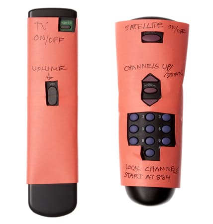
And how technology even as “simple as a remote” can be considered scary for some consumers.
These are examples of poor user experience.
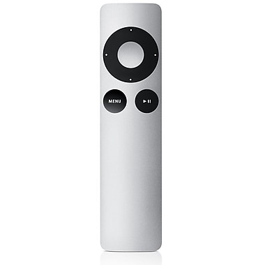
Is this, the Apple TV remote, a better user experience?
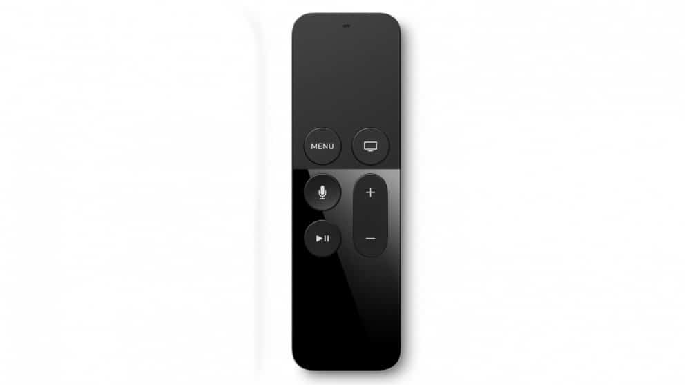
What about the newer Apple Siri remote?
For all new consumer products that are designed, digital or otherwise, they have both UI and UX associated with them. This module introduces the concepts of User Interfaces and User eXperiences and the difference between them and their design disciplines.
Computer Activity
Take a game or mobile application and dissect its UI and UX. Students do not need to examine an entire product and should choose a section such as:
- First menus/Main Menus
- Settings Area
- Main screen (where most of the main game or application is used)
- The flow of completing a task within the game or application
Ask them to present a small demonstration using Google Slides that shows screenshots or images of the content being critiqued.
Ask students to answer the following questions:
- Do you feel this was well designed or not? Explain why?
- What were some things both the UI and UX designer considered when putting together this piece of the product? Did they miss anything?
- How could it be better? Is there a competing product that does it better? If so, in what ways is it better?
Paper Activity
Required Materials – Sticky notes, printouts of the mobile wireframe
Split the class into groups. The instructor can act as the client.
Requirements: The client wants an app that makes suggestions about things to do around Nunavut based on a user’s interests. They want users to use the app when they are “out and about” and during all seasons, whether it is warm or cold. Client would prefer if the user does not have to input data using the mobile keyboard, and would love some alternative options.
First the groups should get together and think about questions they would like to ask their “client” so that they can understand more about their needs. Write the questions down on sticky notes and add the responses to that sticky note so the students have the information in front of them.
Have a Q&A session between the class and the client.
Remind students that other groups may also have good questions. Take down other ideas on sticky notes and add it to the information about the user that has been gathered.
After students conduct some user research, they need to consider how the app should work.
For this activity students don’t have to worry about creating all the screens that would go into making an app or concern themselves with making buttons and other UI elements that are visually pleasing. What is important here is to arrive at an idea of how the app will work overall, what information it will contain, and how the user will interact with it to get the information they need. What information will users receive based on their input?
Groups can use as many of the screen pages as they like.
After an hour (or as much time as the teacher allocates) groups will put their images on the wall. The groups will explain their ideas and their thought process to the client and answer any questions the client has for them. They should showcase the features of their app, and where they felt they needed more information.
It is just as important to be “wrong” or incomplete, and to not know all the answers than to always have good ideas. Collaboration with the group and the rest of the class is important in understanding user needs and filling your “design notebook” with solutions for unknown and anticipated problems. There are no winners or “right answers” in this activity.
Resources
Additional Resources
- UI/UX Inspiration – Handpicked modern inspiration for iOS applications
- YouTube Video – Don Norman, the creator of the term “UX” explains the term
- Researching Job Descriptions – User interface and user experience designers can be difficult roles to define and they can mean something slightly different to different people and employers. An excellent source of information to help define these roles is to look at job descriptions for larger and established companies. You can gain a lot of insight on what are required attributes for people in these roles!
Social Media Resources
- Joel Marsh – Author of UX for Beginners
- UX Fails – A collection of images of some poor UX design decisions
